
Is your website turning users away?
Sorry to break it to you. But if your website isn’t working to keep users engaged and convert them into customers, it could be because your website is annoying them.
To research this article, I spent a few hours trawling through the forums to find out what website users are saying behind your back. And, from this research, I can reveal 25 website features they find irritating enough to leave your website and go to one of your competitors.
So buckle up and let’s dive in.
Quick links
Scroll down to read the full article, or use one of these quick links to find something specific.
5. Badly designed carousels
25 Annoying website features
I’ve been using websites daily for almost three decades and I’ve encountered every one of these 25 annoying features. If you want your website to engage more users, these are problems you really need to look at.
1. Intrusive pop-ups
It’s probably no surprise that pop-ups top the list of annoying website features. And this list isn’t even in any particular order. But ask anyone what annoys them most about websites and pop-ups will pop up. Go on, try it!

The different types of pop-ups
The image for this section references pop-up ads, but there are many kinds of pop-ups your website can have.
For example:
- Mailing list sign-up boxes
- Discount shopping codes
- Limited time offers
- Event/product announcements
- Requests for support or donations
- Requests to take surveys or give feedback.
Why are pop-ups so bothersome?
The main irritation is that they interrupt your user — often with something irrelevant. They’re intrusive, covering the content your user came to see — and they’re not always easy to close down. Some will argue, this is also the reason they convert, but these are usually the people trying to sell them!
Some websites have a succession of different pop-ups or ones that keep popping up repeatedly, even when the user has closed them. In some cases, the pop-ups are badly timed — asking for users to subscribe, pay for content or take a free trial before they’ve even had a chance to decide if it’s something they want.
Issues like these can cause users to feel you don’t respect them or care about their experience. And they may conclude from that, you’re not a company they want to deal with.
2. Autoplay videos
Users land on your website for the first time and — before they can do anything — a video presentation starts playing automatically. It’s unexpected, it has a soundtrack so loud it makes their monitor shake — and it makes everyone around them dive for cover. Which is why it’s on the list.

Video content is a great way to communicate
Let’s be clear, this isn’t a slur against video content. Videos are engaging, they’re an effective way to introduce your brand and most people enjoy watching them.
But people like to be prepared if they’re going to watch a video. They want their headphones plugged in. They might want to move their laptop to a more convenient place. And grab a notepad… a drink… a bucket of popcorn.
Why are autoplay videos a problem?
Autoplay videos don’t allow your users to prepare. They usually launch when your landing page does, with sound and without warning, which be a surprise.
Some autoplay videos don’t allow users to skip, so they have to sit through the whole thing. Some are made using unfamiliar platforms, so it’s not always obvious where the controls are. And some, if you scroll down past them, turn into a modal that follows you down the page.
When faced with issues like these, some users will instinctively hit the back button or close the tab because these are the quickest ways to shut it down.
3. Background music
Ah, background music. Perfect for mooching around shops and creating a party ambience. Not so great for browsing through your website when we need to focus on what we’re reading. Just sayin’.
Sound is an unnecessary distraction
When users visit your website, you want their full attention. Distracting them with a musical backdrop while they’re trying to read will never help you get it. And yes, they have the option to mute it, but if they’re going to do that, what’s the point in having it?
In summary, having background music on your website is never going to work in your favour. Save it for your videos and other media, where it will feel more natural.
4. Impossible captchas
Captchas are those little puzzles some websites make you complete to prove you’re not a robot. Some have sixteen little pictures and you have to click the ones that contain a certain element, like a traffic light or bicycle. Some have slightly scrambled text you have to type into a box.
Thankfully, the captcha below isn’t real. Can you even imagine how long they’d take if they looked like that?!

Captchas do an important job
Captchas are good for security and for making sure those interacting with your website are human. And, to be fair, they’re much better now than they’ve ever been. But sometimes you come across one that’s so bad, it makes it almost impossible to prove you’re human.
What makes captchas impossible?
With photo captchas, the main issue is usually low-resolution photos that are too blurry or grainy to pick out the details. Impossible text captchas make it difficult to distinguish the letters and this can be for several reasons.
Here are some examples:
- Difficult/fuzzy fonts
- Complex backgrounds
- Too much text distortion
- Colours with poor contrast
- Strikethroughs across the characters
- Characters that are too squashed together.
If your website is using captchas that make it impossible for users to prove they’re human, they’ll leave feeling exasperated and they probably won’t be back.
5. Badly designed carousels
Carousels are those mini revolving slideshows you get on web pages. You know the ones. They sometimes show an intro at the top of the homepage and they’re often used to display things like new products, sale items and testimonials.
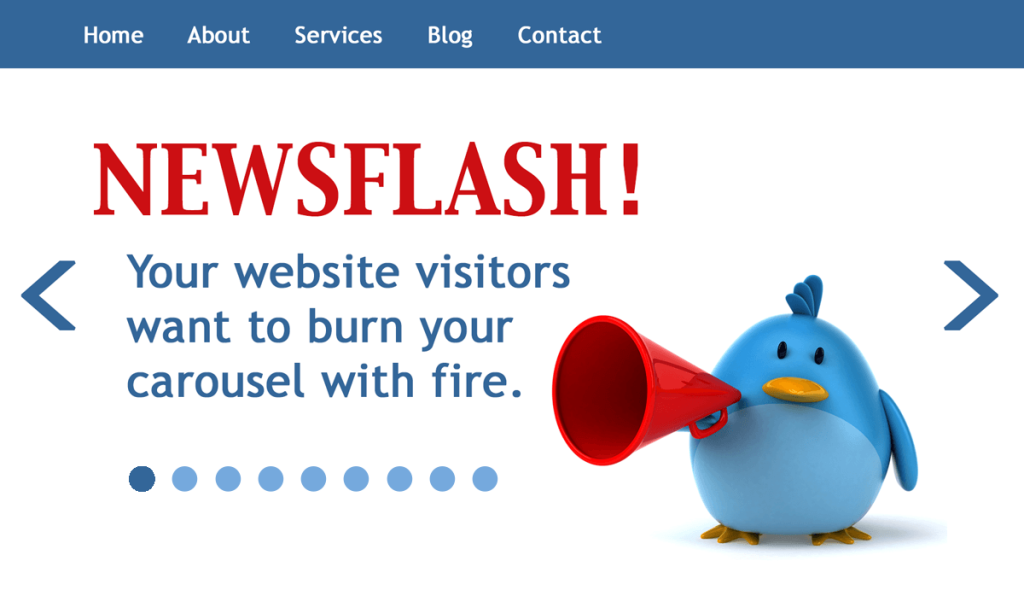
What makes carousels so irritating?
For starters, the timing is always off, with too much text and not enough time to read it before the slide changes. You find yourself constantly pressing the back button and trying to read it before it disappears. Or — if there is no back button — waiting until the slide comes back around again. *Shudders*
Sometimes there are too many slides to sit through. Sometimes the text isn’t worth reading. And sometimes the call to action (CTA) button on the slide doesn’t even work.
If the carousel plays on a loop, you’ll still see the slides changing in your peripheral vision when you’ve scrolled down. This is both distracting and annoying.
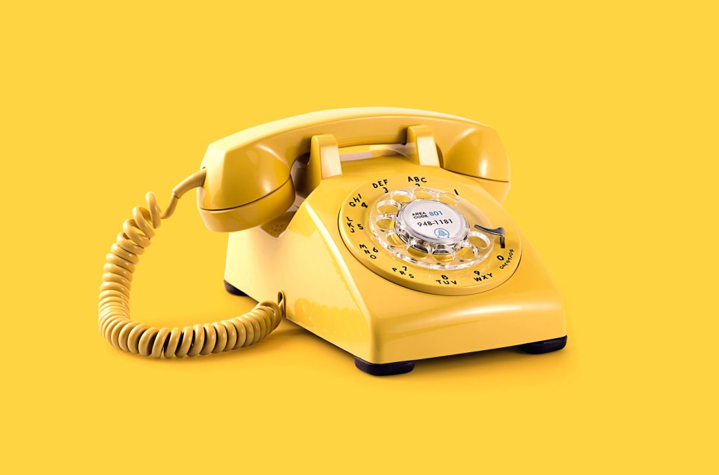
6. Hidden contact information
Contact information is an important trust signal on a website. So hiding it, or making it difficult to find, can be a big red flag. Has anyone seen my yell-o-phone? I’m sure I left it around here somewhere.
Why is hiding your contact information such a problem?
Because malfunctions happen. Mistakes happen. Miscommunications happen. And people like to know they’ll be able to get in touch with you, if they have a problem. Without that information, working with you or buying from you becomes a risk. And it could be a risk your prospects aren’t willing to take.
7. Intrusive cookie opt-outs
The cookie opt-out has become a familiar feature on websites since the GDPR laws came in, back in 2016. It’s also something that can be unnecessarily annoying.
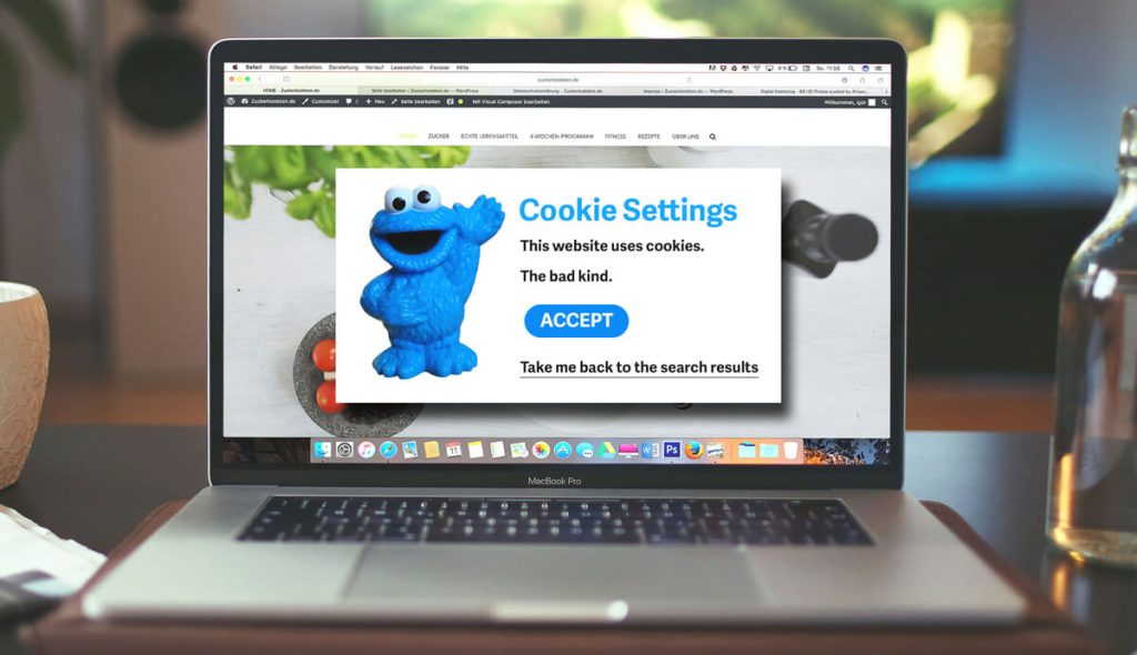
The cookie notice is a necessary evil
Your website has to have a cookie notice, but it doesn’t have to cause headaches.
These days, website users like to have the option to refuse cookies. A simple decline or reject button is all your cookie notice needs to have. One click, the job is done and the visitor can continue looking at your site. But often this isn’t what happens.
When do cookie notices annoy people?
The cookie notice becomes an annoying website feature when it’s unnecessarily huge and intrusive. Before the user is ready to accept or declines cookies, they want to make sure they’re in the right place. When your notice appears in the middle of the screen, covering the content and demanding action, they can’t do that.
Cookie notices are annoying when they’re unnecessarily complex. When the choices are accept or set preferences and the option to set preferences is mind-boggling. This feels like you’re not actually giving users a choice. And when your options are accept or return to the search results, that’s an outright ultimatum.
In other news, some websites are now charging users to reject cookies. That’s right, you either accept the cookies or you have to pay. But leaving without doing either is still an option.
8. Prying forms
Users value their privacy. And they’ll be immediately suspicious of forms that ask for a lot of seemingly unnecessary information. The form below is an extreme example of this, but you get the idea.
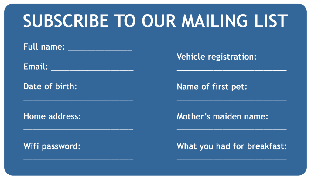
Prying forms are a red flag
When you’re creating a form, you should only ask for the details you need to provide the service your user is signing up to. If it’s a mailing list, an email address and a first name should suffice. If you’re asking for company names and telephone numbers, your users will be wondering why and what you plan to do with them.
Prying forms are a particular annoyance to users who want to take you up on your offering, but don’t want to give you so much of their data. And they could mean you’re losing people who are genuinely interested in connecting with your brand.
9. Broken links
Broken links are infuriating. Imagine your user has come across a link to a page on your website — something they’ve been searching for and might be desperate to see. But then they get this:
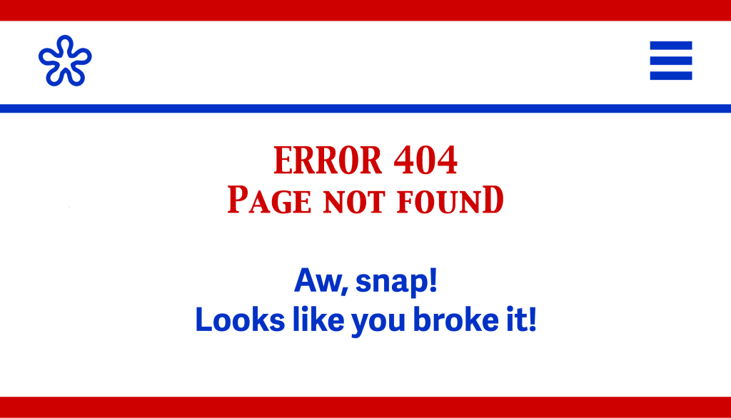
Why are Error 404 pages so annoying?
Even if it’s mildly amusing, nobody really wants to see your 404 page. They want to see the page they thought they were being directed to. And if they find it isn’t there, they’ll be disappointed.
The worst Error 404 pages are the ones that:
- Aren’t customised for your website
- Make users feel like it’s their fault
- Don’t give helpful alternative links.
These will almost definitely result in users returning to the search results page to find another option.
Incidentally, your web platform may have a broken link plugin — so find it and use it. If not, there are plenty of broken link checkers online.
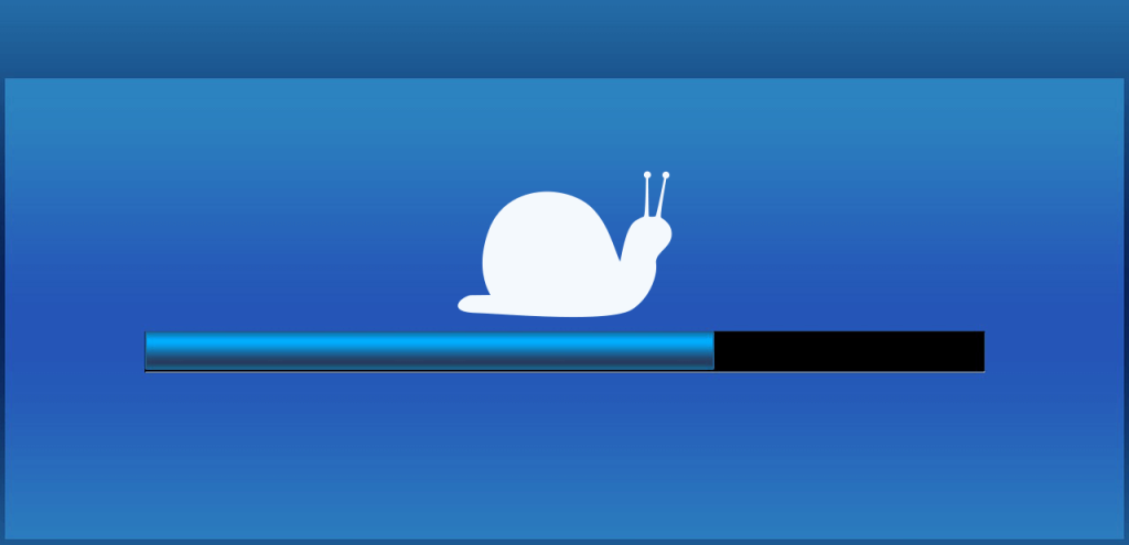
10. Slow loading
You click on a link and then you wait… and wait… and wait for the page to load. Or do you?
We’re not in the 90s any more
In the 90s, the internet was painfully slow. We accessed it on dial-up and we had to wait for websites to load. Pages with pictures would appear line by line — like the screen equivalent of a dot-matrix printer.
It wasn’t quite so much of an issue back then. After all, we were a generation that loaded video games on cassette tapes, so we were used to waiting. But today, we’re not so forgiving.
Slow loading pages will cost you visitors
If your website and its media are properly optimised, it shouldn’t take forever to load. In fact, ideally, it should load in three seconds or less. That’s how long you have before users start getting impatient and decide to go elsewhere.
So how do you know if you have slow-to-load pages and what can you do about it? I’m glad you asked. Experte.com has developed a bulk page-speed checker that will check the loading times across your whole website and give you a score out of 100 for each page.
To use it, enter your website URL and let the site do its thing. If a page score is low, scroll to the end of that row and click on Details to find out how you can improve it.
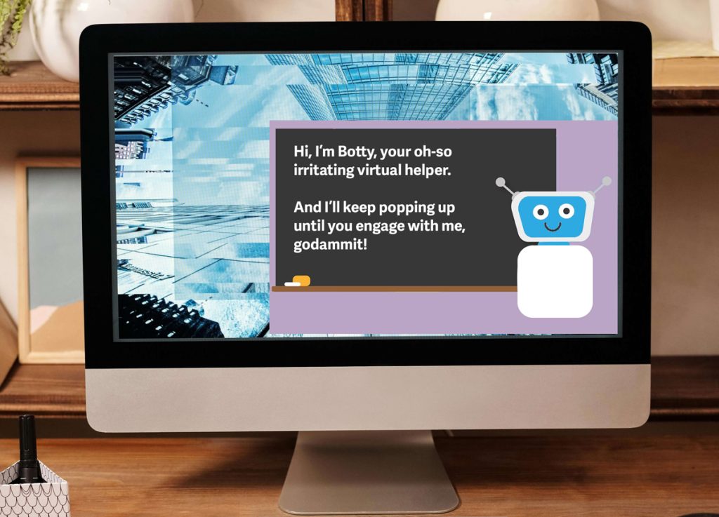
11. Pushy chatbots
A chatbot is a bot you can chat to if you have questions or need help while on a website. They’re usually found in the bottom right-hand corner of a website. And, like the most annoying pop-ups, they have a tendency to pop out intermittently and ask if you need help.
Me: “How do I permanently disable you, so you’ll stop bothering me?”
Chatbot: “I don’t have an answer for that.”
No, of course you don’t.
Chatbots are supposed to be helpful
In theory, chatbots aren’t the worst idea. I mean, if they could actually help you and save you from having to call the helpline, that would be good. Sitting in phone queues and dealing with people isn’t most people’s idea of fun.
But more often than not, they can’t help — and this just causes frustration.
What makes chatbots such an annoying website feature?
First, some chatbots are repeatedly popping out and covering the screen, forcing users to keep closing them down. That, in itself, is annoying.
Second, some chatbots have very limited functionality. They can only answer a few basic questions — and only if the questions are phrased in a very specific way. But those kinds of questions should already be answered in the web copy, so the chatbot shouldn’t even be necessary.
A chatbot that constantly shoves itself in your users’ faces, but can’t help them when they need it is bad for your brand. It doesn’t show your users you care about them or their experience — and that can be a dealbreaker.
12. Forced logins
You find an article you want to read — but you can’t. Unless you subscribe to the website and create an account.
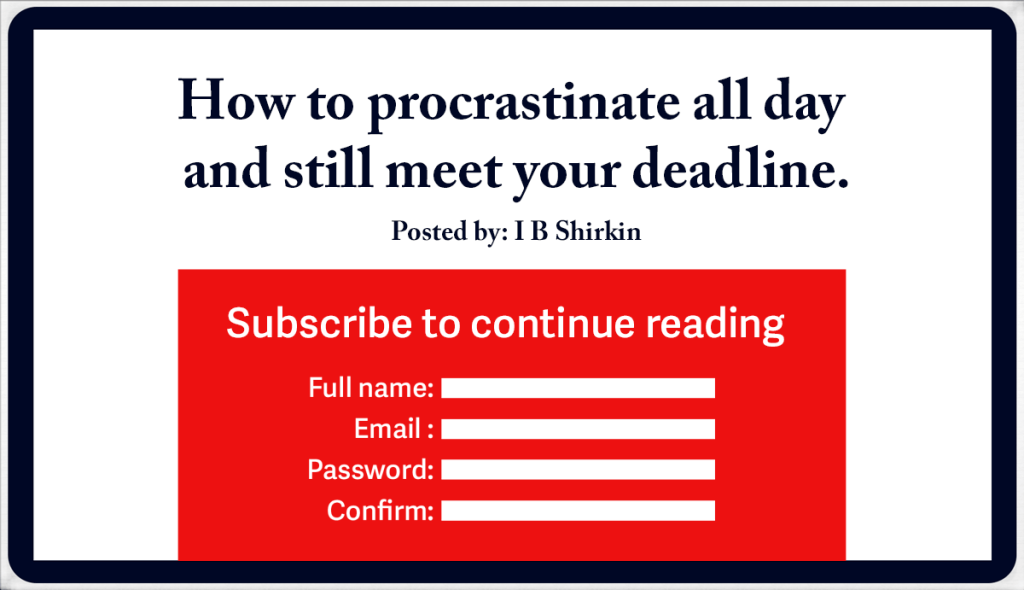
Why are forced logins so annoying?
Asking for a login to access the most basic features of your website is a major irritation and a hurdle that some users won’t be prepared to jump. Especially if they may only use your website once, to access one article.
And demanding new users create a login before you allow them to read anything is unreasonable. Why should anyone be comfortable giving you their data when you haven’t shown them what you’ll be giving in return?
The key is to show your audience value, because then you’ll get their buy-in without having to ask for it.
13. Tricky navigation
Effective website navigation helps your users find what they’re looking for as quickly and easily as possible. This rule applies to all websites. Unless your website is supposed to be a cryptic puzzle, of course — in which case, as you were.

How navigation should be helping your users
Ideally, users should be able to reach any page of your site within three clicks. You should aim to anticipate their needs at each point of their journey.
Your website navigation might include:
- Navigation bars across the top of your site
- Grids of images representing categories
- Service or pricing tables with links
- Pop-ups that link to current popular content
- Well-placed and obvious internal links
- Links to associated content users might appreciate.
Following the website standard, with commonly recognised pages (Home, About, Services, Contact etc) will also help, by making your user experience familiar and intuitive.
When does navigation become tricky?
Navigation gets tricky and annoying when it has:
- Unfamiliar or ambiguous menus
- Unconventional site maps
- Unfamiliar icons instead of clear text
- Badly organised content
- No site search function
- An overwhelming amount of choice
- Huge and unwieldy dropdown menus.
The outcome here is obvious. Because if a user can’t find what they need, they’ll have no reason to stay on your site and they’re never going to buy from you.
14. Pesky paywalls
Paywalls: unexpected pop-ups you can’t close down without committing to making a regular payment. Sometimes they’ll appear before you’ve even seen any content. Sometimes, as in the example below, they’ll appear when you’ve exceeded your free quota. No more soup for you!*
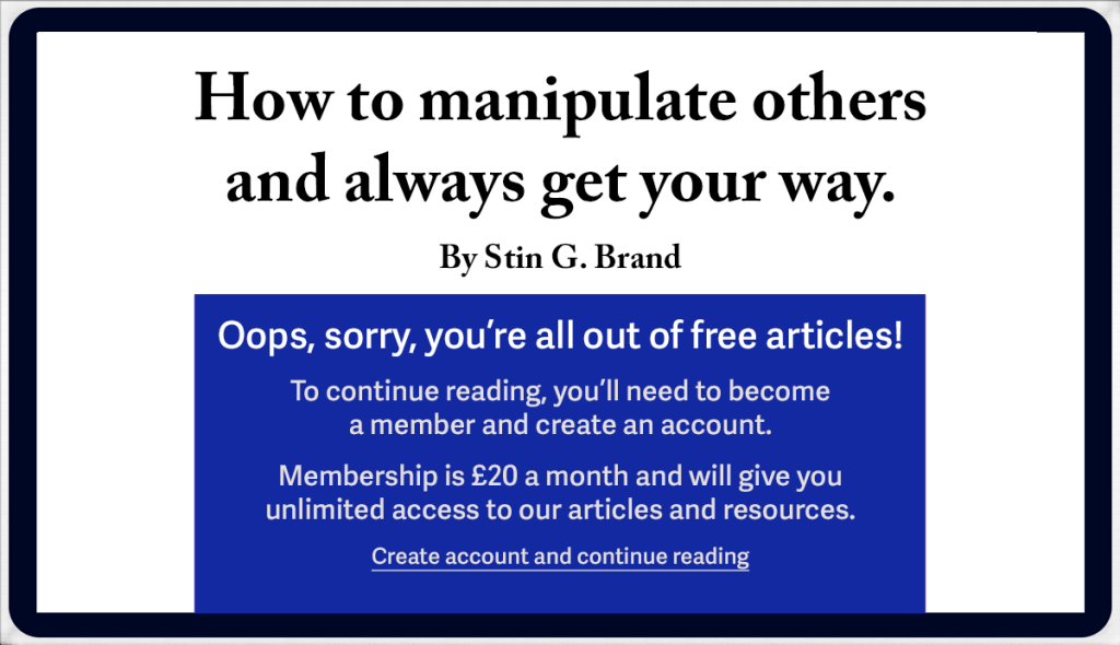
Premium content comes at a price
If you’re a high authority website and you’re creating content your industry peers rely on, charging for it is fair enough.
But you have to be renowned enough that the people who sign up for your content know what they’re getting. And your content has to be valuable enough to them that they’re happy to pay for it.
What makes paywalls an annoying website feature?
If you’re not a well-renowned, high authority website and you’re trying to charge your users, it will seem like an imposition. Especially if you haven’t even given them a chance to read your stuff first.
In another scenario, you have someone who’s enjoying your content and wants to consume more of it. But then you put a paywall in their way and demand money to let them see it. Isn’t that the website equivalent of shooting yourself in the foot?
When faced with the ultimatum of pay up or go away, some visitors will always choose the second option.
*Little Seinfeld reference, there.
15. Poor responsive design
Today, we view websites on a variety of devices with different sized screens. Responsive websites adjust their size automatically to give you the best experience on whichever device you’re using.
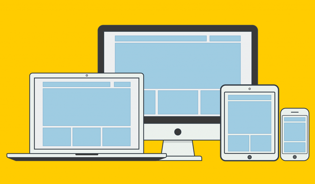
Poor responsive design gives a poor user experience
Reputable web designers will test their designs across a range of devices and screen sizes to make sure they display properly and give the best user experience.
If you’ve built your own website, with limited web design experience and a DIY platform, you probably haven’t done this.
So you may not be aware of issues like:
- Images not resizing correctly
- Page elements crashing together
- Text links that are too small or too close together
- Pop-ups with the close-down button beyond the edge of the screen.
Issues like these, that make it difficult or impossible to use your website, will make your users decide to leave.
16. Lack of clarity
On a website, clarity is everything. Seriously, your visitors are flying solo here. They won’t have you to ask if they don’t understand something, so you have to make sure your message is crystal. Capiche?
As a copywriter and editor, I’m pretty good with words. And I can usually figure out what a piece of copy is trying to say — even if it doesn’t quite nail it. But even I’ve left websites because I didn’t understand what the company did.

Why clear is better than clever
I’m certain some of the websites that have confused me have been written by AI.
Some business owners like AI because they think it sounds smart. I’m convinced some of these business owners are trusting AI writers without any moderation — and in some cases without truly understanding what their copy means.
Just take a look at this monstrous sentence:
❌ We leverage our extensive expertise in aqueous distribution to provide comprehensive fluid conveyance infrastructure management solutions to domestic and commercial customers.
If you write like this on your website, nobody is going to have the faintest idea what you do. And they’re not going to waste mental energy trying to figure it out, either.
So cut the jargon and keep it simple:
✅ We install, repair, and maintain plumbing systems for homes and businesses.
17. Questionable images
I once knew a freelance web designer who ran his business from his bedroom in his parents’ house. His website, however, was covered in images of business professionals, like these, in swanky offices with floor to ceiling windows and views across a city. True story.

What makes images like these annoying?
People aren’t stupid. When they’re presented with something they perceive to be fake, or questionable, they know it. And if they feel they’re being duped or manipulated, that’s only going to annoy them and make them click away.
18. Keyword stuffing
Keyword stuffing is where you repeat a word multiple times in a piece of content so Google knows what you want it to rank for. Or, rather, it used to be — back in the early noughties — but even then it was a bad idea.

Why is keyword stuffing so problematic?
Keyword stuffing is a surefire way to annoy website users.
First, because they’ll know the content was written for Google’s benefit — and not for theirs. Rude.
And second, because keyword-stuffed content sounds unnatural and is horrible to read — which means they probably won’t bother.
19. Access requests
You arrive on a website and it immediately asks for access to your location, camera, microphone or photographs. Err… we’ve been acquainted for precisely three seconds. So, no.

Why do users find access requests annoying?
Some of the things on this list are cheeky and presumptuous. But this one feels invasive, creepy and stalker-ish. Like someone asking if they can peep at you through your bedroom window.
There’s no reason why a website would need access to any of these things from a new user. It will just make them uncomfortable and uneasy.
20. Sticky elements
Sticky elements are design features that stay fixed on the screen as you’re scrolling.

Sticky elements are meant to enhance the user experience
The sticky header stays in place, at the top of the screen, while the content scrolls under it. It means the user always has access to the main navigation bar without having to scroll back up.
Same with the links and menus on the side of the screen, that follow you down as you scroll — just in case you need them.
Why do people find them so irritating?
As technology has changed and screens have got smaller, users have found these sticky elements an intrusion that takes up too much of their screen space. And often there’s no option to minimise them or close them down completely, so users are stuck with them — pun intended.
21. Text issues
Text that’s difficult or impossible to read is guaranteed to send your users back to the search results.

What text issues are annoying for users?
Issues with text can make it hard to read, especially for people who have visual or processing challenges.
Here are some examples:
- Poor font choices
- Using too many different fonts
- Centre-aligned or justified body text
- Poor contrast between the text and the background
- Text on patterned backgrounds that make it difficult to see
- Large, unbroken walls of text that are hard to read on a screen
- Text that’s so small you have to zoom in and scroll from side to side to read it.
22. Clickbait
I’m sorry, have we gone back to the 2010s when clickbait was rife and terrible?
Apparently, it’s still around and I saw a LinkedIn post citing an example just this morning.
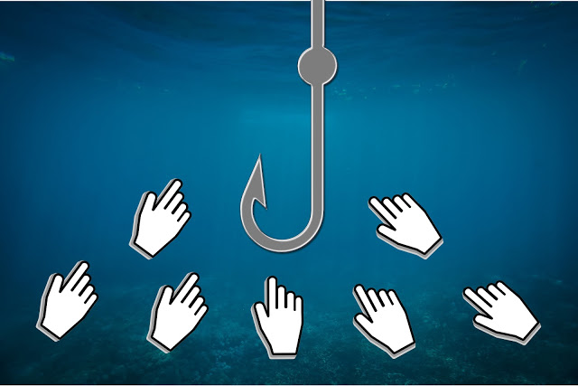
Do I need to explain why clickbait is annoying?
For anyone who doesn’t know what clickbait is, it’s when websites use sensationalist or irresistibly intriguing headlines that bait you to click on them. But when you click through to the content, you find it’s been massively overhyped and doesn’t deliver what it promised.
Posting content like this will not only annoy your users, but destroy their trust in your brand.
23. Broken processes
A user is on your website and has gone through the process of getting in touch with you or buying something only for the process to malfunction at the end.

How do broken processes annoy users?
Imagine a user has just written a difficult message where they’ve tried to explain a complex problem they’re having. They hit send on the contact form and nothing happens. There’s no acknowledgement that their carefully crafted message has been sent and the form has emptied itself so their message has disappeared.
Or the user clicks to complete a transaction to buy something they really wanted, but the process screws up at the end, leaving them disappointed and without their purchase.
24. Tampering with the back button
The user decides this website isn’t what they were looking for, so they hit the back button to go back to the search results but, instead, the page they’re already on reloads. They hear an evil laugh “Mwahahaha! You’re stuck here forever and you’re never leaving!” Okay, I may have made that last bit up, but the page reloading does happen.
This is annoying and pointless
The user has already decided they want to leave — but the website has decided they can’t.
Did the website owner think making the back button reload the page would change their mind and make them stay?
By the time they reached this website, the user could have been through several search engine results pages (SERPs). Maybe so many they couldn’t even remember which SERP they were on. And now, thanks to this nonsense, they’re going to have to start their search all over again. Grrr.
25. Dark UX
That’s dark, meaning shady, and UX, being short for user experience.
I know I said this list wasn’t in order, but I’ve saved the best for last.
Dark UX, also known as Dark Patterns, is probably the most annoying of all. Because this is where websites play dirty. Using design and copy to mislead, confuse and trick users into doing things they don’t necessarily want to.

Dark UX comes in many forms
Dark UX has a spectrum. It goes from websites being cheeky and presumptuous to website owners being prosecuted for deliberately misleading and manipulating their users. So it’s something you definitely want to avoid.
There are a number of ways websites use these dodgy tactics. In fact, it’s such an extensive topic that it has its own article: We need to talk about Dark UX >>
Why is Dark UX so annoying?
Nobody wants to feel they’ve been deceived, manipulated or taken for a fool. Any website that makes them feel like that won’t win their favour — or, indeed, their custom.
A user’s annoyance level will depend on the seriousness of the villainy and how they perceive it. This is subjective. Some people will rage at boxes being pre-ticked on the bottom of a form — others will just roll their eyes and untick them. But most people will be angry if they’ve been conned out of money.
You might also like…


About the author
I’m Jenny Lucas, a freelance copywriter based in Leicester, UK.
I’ve been working as a copywriter since 2005 and have a particular fondness for websites, which is why I specialise in writing SEO copy and content.
You can find out more about me and the work I do: