
Your website isn’t converting
You’ve invested in a website for your business and you think you’ve done everything right. But, for some reason, it’s just not working to create the sales and enquiries you need.
So what’s the problem?
Why are your visitors abandoning their shopping carts or leaving without getting in touch?
I may have some answers for you.
Quick links
Scroll down to read the full article, or use one of these quick links to find something specific.
1. It doesn’t show up on Google
5. Your visitors don’t understand what you do
6. Your navigation is confusing
7. Product information is missing
8. There’s a lack of social proof
9. Your website looks unprofessional
10. There are problems with the Calls to Action (CTAs)
11. You’re offering too much choice
12. There’s a lack of contact information
13. There are too many hoops to jump through
15 Reasons why websites don’t convert
This article was created with input from the lovely people of LinkedIn, who responded to my questions on what had stopped them from buying from a website or from getting in touch about the services.
1. It doesn’t show up on Google
If your website isn’t showing up on Google, nobody will be able to find it. And if nobody can find it, no wonder it’s not bringing in any business.
Not sure whether your site is showing up on Google?
If your site is less than six months’ old, there’s a good chance it may not have been listed yet, but you can always check. If your site has been online for longer than six months, you can check it’s listed on Google, then see where it’s ranking.
How to find out if your website is listed on Google
A quick test is to copy a couple of sentences from the home page and paste them into Google with speech marks around them. The speech marks will tell Google you’re looking for this exact text.
When Google shows the results, your website should show up at the top. If it does, that’s good news because it means your site is listed on Google.
How to find out if your website is ranking
For this, you’ll need access to your Google Search Console account.
Search Console is a free tool provided by Google. It collects data on how your website is performing, including what keywords it’s being found for and where it’s ranking for them. You may already have Search Console on your website. If you don’t, you’ll need to add it and give it some time to start collecting data.
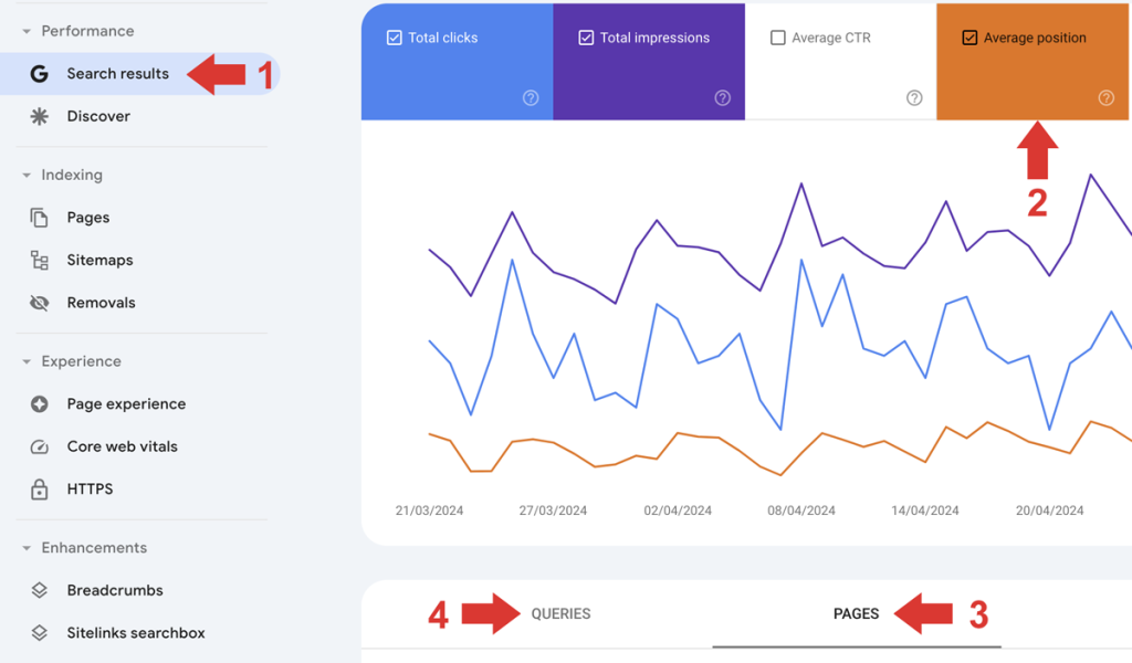
To see where your site is ranking, open Search Console and do the following:
- Select Search results from the menu on the left
- Make sure the Average position box is checked (it will also turn orange)
- Select Pages from the menu underneath the graph to see a list of all the pages you have listed on Google, then click on your homepage URL
- With your homepage URL selected, click on Queries to see a list of phrases your site is ranking for.
For each phrase, you can see:
- Clicks — the number of times someone searching for this phrase clicked through to your website
- Impressions — the number of times this phrase was searched for
- Position — the average position at which your page ranks for this phrase.
If your page isn’t ranking well
If your website is ranking for the wrong kinds of keywords, or outside the top 10, that means you have some work to do.
If the issues are with your website copy or content, I may be able to help you.
Visit my main website >> to find out more.
2. It loads too slowly
If your website takes too long to load, your would-be visitors might not be prepared to wait. And if they leave before your site has loaded, they won’t be converting into customers any time soon.

Your website should load as quickly as possible — ideally within three seconds.
According to NVisage Digital, If your loading time creeps up to 4 seconds — just one second more — you can expect to experience:
- An 11% drop in your page views
- A 7% drop in your conversions
- A 16% drop in customer satisfaction.
And these percentages will keep increasing for each additional second. Yikes!
How to improve your website’s load speed
To check the load speed of your website, head to GTMetrix.com and input your URL.
If improvements can be made, you’ll find details further down the results page.
3. No cookie opt-out
Mmmm… cookies! Cookie Monster loves cookies. Your potential customers, not so much.

GDPR and cookie consent
Cookie consent was part of the GDPR regulations, introduced in 2018. It required all websites using cookies to display a cookie notice and ask users to consent to the use of cookies before entering.
Some websites are now giving visitors the option to reject non-essential cookies or decline cookies completely. And many visitors are taking one of those options.
What are cookies used for?
Cookies are text files that store information, like form data and ad tracking.
On the plus side, they make things more convenient. For example, they can automatically sign you into websites, save information about products you looked at and retain any items you might have left in your shopping basket.
But many visitors have privacy concerns and want the option to opt out of cookies — or at least reject the non-essential ones. If there’s no option to do either, your visitors might not feel comfortable engaging with your website, let alone buying from you.
How to check your cookie consent/opt outs
You should be able to see what cookie consent/opt-outs you currently have on your site by visiting your site in Private or Incognito mode.
If you find you’re not giving visitors an opt-out, and you want to, your web developer should be able to fix that for you.
4. Pop-ups
Pop-ups are divisive
Pop-ups were mentioned by several of the people who responded to my LinkedIn post. For many, they’re an unnecessary aggravation that interrupts the user experience. But while some visitors will just close them down without taking any action, others will leave your site immediately.
Make your pop-ups the best they can be
If you have pop-ups on your website, you need to make sure they’re working properly and that they’re not going to annoy people too much. I’ve included some advice on this in my article:
How to improve the pop-ups on your website >>
To pop-up or not to pop-up?
If you’ve improved your pop-ups as much as you can and you’re still not getting enough conversions, try removing them for a while and see if things improve.
5. Your visitors don’t understand what you do
You might be thinking, whaaat?! No way! That’s such a basic thing! And, of course, you’d be right. But it happens much more than you might think. And if your visitors don’t get you, they’re not going to convert.
I wonder what this company does. Any ideas?

Your Hero Section is a villain
Your Hero Section is the section at the top of your homepage and it’s the first thing your visitors will see when your website loads.
Within the first few seconds, your Hero Section should tell them clearly and unambiguously:
- Who you are
- What you do
- Who you do it for
- Why they should care.
This is important.
It takes visitors an average 15 seconds to decide whether to stay on your website. So you need to give them a reason to stay and scroll down, by making it clear you have what they need.
If you’re vague, wordy or make it too complicated, they’ll leave — along with any chance you had to convert them.
How to improve it
Let’s have a look at that ‘Water Solutions’ Hero Section copy and make it stronger and more specific.
WATER SOLUTIONS
Instant hydration with fresh, chilled drinking water on tap
Affordable water cooler rental for offices big and small.
Now it tells us:
- Who they are — Water Solutions
- What they do — Water cooler rentals
- Who they do it for — offices big and small
- Why prospects should care — because it’s convenient and affordable.
6. Your navigation is confusing
If your navigation is confusing and doesn’t help visitors locate what they need quickly and easily, there’s a good chance they’ll leave your site and look for it elsewhere.

The best website navigation
Your navigation should be simple and intuitive, making it easy for visitors to find what they need. And your website should be structured so that visitors can reach any page within three clicks.
See how visitors are using your site
You can see how visitors are moving through your site — and where they’re leaving it — by looking at Path Exploration (formerly Behaviour Flow) in Google Analytics GA4.
Or by using apps like Hotjar, which create heatmaps and real-time video to show how visitors are interacting with your site.
This will help you identify problem pages or areas you need to look at.
How to test your navigation
You can test your navigation with a friend or family member who’s never been on your site before. Give them a list of products/services/information to locate and see how easily they can find each thing.
7. Product information is missing
When they’re buying online, visitors need to feel confident their purchase is going to meet their needs. And they might also want to see how your product compares with other similar products they’re looking at.
If this vital product information is missing, they won’t be able to choose your product — and they won’t convert.

Deciding what product information to display
Important information might include your product’s:
- Dimensions
- Manufacturing materials
- Features (for comparison)
- Compatibility/connections
- Limitations/constraints.
If you’re not sure what information your visitors need to see, you can check your product’s sales literature — or, even better, check your competitors’ websites.
8. There’s a lack of social proof
Visitors will want to know they’re buying from a business they can trust. Social proof is one of the most compelling things that will convince them of that.
If you don’t have any — or don’t have enough — they might be inclined to go elsewhere, which means they won’t convert into the paying customers you need.

What is social proof?
Social proof is positive feedback your clients or customers have given about your product or their experience of working with you. And it usually takes the form of reviews, testimonials and case studies.
If you don’t have social proof when all your competitors do, it will make you look less credible and visitors might think it’s because you’re too inexperienced or you have something to hide.
How to get social proof
The only way to get social proof is to ask your clients or customers for it.
And it might feel awkward asking them, but you know what happens if you don’t ask!
To make it easy for your clients, give several options of places to leave reviews (e.g. LinkedIn, Google, Trustpilot) so they can choose the one that’s most convenient for them — and provide them with a direct link.
To get a more individual and non-generic review, give your clients some guidance in the form of a framework with questions to answer.
For more information, check out my article Creating a project wrap-up form >>
9. Your website looks unprofessional
A website that looks unprofessional won’t inspire confidence or build trust.
Your visitors will surmise that if you’re careless about your website, you’ll be careless about other things, too. And they won’t convert.
Signs of an unprofessional website
Errors that give your visitors cause for concern include:
- Typos and grammatical mistakes
Mistakes like this make you look lax and sloppy. - Page elements crashing together
A poorly considered design will make you seem amateurish. - Lorem ipsum placeholder text
All placeholder text should be overwritten with your proper web copy. - Watermarks on your images
A watermark is a sign that an image hasn’t been downloaded or paid for.
How to fix your mistakes
Using spelling and grammar checkers will only get you so far. These tools sometimes give the wrong advice — and there are still errors they won’t pick up.
If you’re not confident about the quality of your copy, a human proofreader or copy editor is best. These professionals understand context and nuance better than a machine ever will and they’ll be able to give your copy the attention it really needs.
10. There are problems with the Calls to Action (CTAs)
The CTA is the action you want your visitors to take that will lead to the conversion. So it figures that if there are problems here, it will be affecting your conversions.

Examples of CTAs
Your CTA might be:
- A ‘buy now’ or ‘get in touch’ button
- An instant quote form
- A telephone number
- An email address
- A contact form
- A sign up box.
How to check your CTAs
Make sure your CTAs are:
- Placed at all the points on your website where you want your visitors to take action
- Clear and obvious, so visitors know what to do and what the outcome will be
- Correct, in the case of phone numbers and email addresses
- Linking to the correct landing page or page section
- Working properly and following through correctly.
Test your CTAs regularly, especially sign-up boxes and forms. Sometimes browser and platform updates can cause them to stop working.
11. You’re offering too much choice
You might think offering lots of choices is a good thing. But choice paralysis is real. And when visitors feel overwhelmed by the number of choices, they often end up making no choice — and not converting.
Let your visitors narrow it down
If you have a lot of stock to sell, the best thing you can do is allow your visitors to apply filters. This helps them focus their search on the criteria they really want.
For example, if you’re selling dresses you might allow visitors to filter on the basis of:
- Size
- Brand
- Colour
- Garment
- Price range
- Pattern/solid.
12. There’s a lack of contact information
If the only means of contacting you is the contact form on your website, visitors will be understandably cautious. Because what if there’s a problem? What if they want/need to speak to someone? Or what if they want to email you so there’s a record of your communications?
A lack of contact information can be a deal-breaker and scupper your chances of a conversion.
What contact information to include
Ideally you should have a number of ways for people to get in touch and they could include:
- Telephone
- Contact form
- Social media.
If you’re a freelancer, like me, you may not want to advertise your phone number, because phone calls can be a distraction. But you can say you’ll make your phone number available to clients when you’re working together.
13. There are too many hoops to jump through
An arduous conversion process can easily turn into an abandoned conversion process.
Several members of my LinkedIn community raised this issue. One lady had been on a website where she had to go through six click-throughs before she was able to buy a product. She’d decided not to buy way before the sixth, but kept clicking out of curiosity, to see how deep the rabbit hole went.

Your conversion process should be quick, simple and friction-free. If it isn’t, your visitor will have cause to stop and think twice before completing it.
What makes a conversion process slow and difficult?
Here are some examples of things that might be hampering your conversions.
An overly complicated conversion process with too many steps
Your process should be quick and painless, with as few steps as possible.
Asking users for more information than you really need
People are naturally wary about giving too much personal information online, so be mindful of that and ask for the bare minimum.
Forcing users to create an account
Insisting users create an account to buy from you can add several more steps to the process, which means several additional drop-out points. And they might decide they’re not comfortable creating an account, especially if this is a one-off purchase and they’re not going to be regular customers.
Asking users to create a ridiculously complex and sophisticated password
I’ve given up on several websites when none of the passwords I created were acceptable. If you want something more foolproof, have your site set up to autogenerate one.
Poor performance such as delayed response or clunky operation
If your process isn’t giving a friction-free user experience, this could be a reason your site isn’t converting as it should.
Interrupting the process to upsell
Some websites interrupt the buying process to show offers, discounts and extras in the hope that the customer will buy more. But this is a risky strategy that doesn’t always work and can result in the purchase being abandoned.
A broken or defective process
It pays to regularly check your process is working properly with no sticking points.
Signs of a broken process might include when the process:
- Keeps resetting itself
- Shows an error message
- Keeps looping back to a previous step
- Doesn’t complete or tell the user when it’s completed.
14. Surprises at the checkout
Your visitor is at the checkout and the conversion is almost in the bag. But then you hit them with something unexpected and they abandon the purchase.

Reasons for cart abandonment at the checkout
- Users finding their product is incomplete and needs appendages, which are sold separately
- Astronomical delivery charges
- Unexpected additional fees
- Concerns about security
- Lengthy delivery times
- Limited ways to pay.
Your website visitors won’t like nasty surprises. Leaving vital information and additions like these until the last minute can come across as sneaky and make you seem untrustworthy.
Always be transparent
Visitors like to know where they stand, so it always pays to be upfront and transparent — particularly when it comes to costs and timescales.
15. Poor response
One of the LinkedIn commenters who answered my question told me they didn’t buy from a website because they had a poor response from the business.
This is entirely avoidable.
Respond — and respond positively
You should reply to everyone who enquires about working with you — even if it’s a ‘thanks, but no thanks’.
When you respond:
- Be friendly, polite and enthusiastic
- Answer any questions you’re asked, if you can
- Ask any questions you need to give your answers
- Make the person feel their enquiry is important
- Make them feel they’re being listened to and understood.
If the project isn’t a good fit for you, you could advise the enquirer on how to better their search. Or recommend someone you know who would be a better match.
Consider changing your approach
If you find you’re consistently getting the wrong kinds of enquiries from the wrong kinds of people, it might be a good idea to look at the messaging on your website and fix it.
This may not be something you can do yourself because you’re too close to your business. But a professional copywriter who offers copy reviews will look at your website more objectively and should be able to point you in a better direction.
To recap
For prospects to convert into paying customers, you need:
- A website that can be found for the right keywords on Google
- Copy and content that builds trust and inspires confidence
- A fast, responsive and fully functioning website
- A quick, simple and friction-free conversion process
- Clear copy that’s precise and explicit
- Comprehensive information
- Transparency.
Do you need help with your website?
If your website isn’t working as it should to bring in the new business you need, maybe I can help.
I’m Jenny Lucas, a freelance copywriter and content writer based in Leicester, UK.
For 15+ years I’ve been creating high-performing SEO copy and content for websites and blogs. Helping businesses achieve a better organic ranking on Google, attract more of the right prospects and convert them into paying customers.
You can learn more about me and what I do:
- On my main website >>
- On my blog >>
- By getting in touch >>

You might also like…