
UPDATED SEPTEMBER 23, 2024
What does UX stand for?
UX is the standard abbreviation for User eXperience — and, as terms go, it’s pretty self-explanatory. It refers to the experience someone has when they use a particular product, service or system. That includes things like software, websites, apps and online platforms.
What is Dark UX?
Dark UX, also known as Dark Patterns, refers to the shady side of user experience. It’s where user experience gets devious, manipulative and deceptive. Where design and copy collude to mislead, confuse and trick users for the benefit of a website’s owners.
For example, Dark UX might get users to:
- Spend more money than they’d planned to
- Buy more items than they really needed
- Share more personal information than they wanted to
- Subscribe to things they never intended to
- Give more permissions than they wanted to.
That’s sneaky!
Yep! Apparently, it all came about as people were obsessing over their websites’ Conversion Rate Optimisation (CRO). In their dogged pursuit of increasing their conversions, some took it way too far. And when their techniques were found to work, people started applying the same devious thinking in other areas, too.
The term ‘Dark Patterns’ was coined by UX designer, Harry Brignull, in 2010. He registered the name darkpatterns.org (now deceptive.design) and used it to create a resource that names and shames the websites using these deceptive and manipulative tactics. He also released a book called Deceptive Patterns in 2023.
There are laws to protect us against certain forms of Dark UX and companies have been prosecuted for using them. But, even now, you can still see it in action.
If you want to know when you’re being manipulated and deceived, come with me to the dark side — and bring snacks!
Quick links
Scroll down to read the full article, or use one of these quick links to find something specific.
How to spot Dark UX at work
Here are 22 examples of Dark UX I’ve seen on my travels around the web.
1. Additions at the checkout
When you’re about to make a purchase, some websites will suggest additional items you might want to buy. Websites with Dark UX just decide you’ll want them anyway and add them to your purchase.
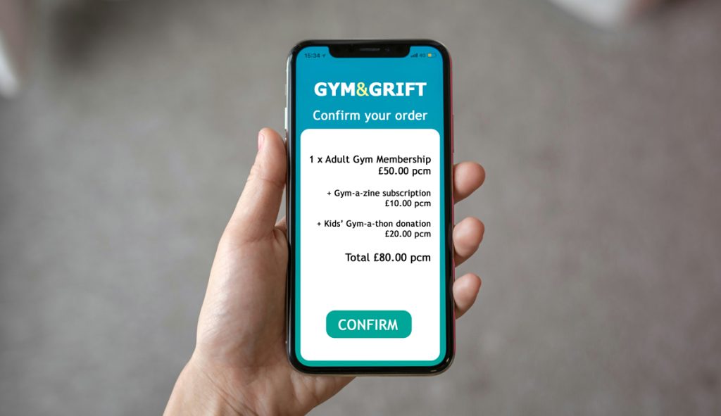
Websites that do this are banking on some people just pressing confirm without even looking at the list.
The person in the picture thought they were just signing up for gym membership at £50 a month. But there’s now a magazine subscription they didn’t notice when they were signing up. Was it obligatory? How do you go back and check?
And a donation. Was that obligatory, too? If it’s for a kids’ charity, it might seem mean to remove it.
They could just cancel, but they’ve come this far through the process and they really want to join this gym. So they press ‘confirm’ and settle for spending an extra £30 a month on things they never asked for.
People with more money than sense are Gym & Grift’s ideal clients.
2. Ads disguised as content
This happens on websites that incorporate third-party advertising.
The websites deliberately make it difficult for you to distinguish between their own page elements and those of their third party advertisers. This is because whenever you click on an ad, the company gets paid.
Make it rain!
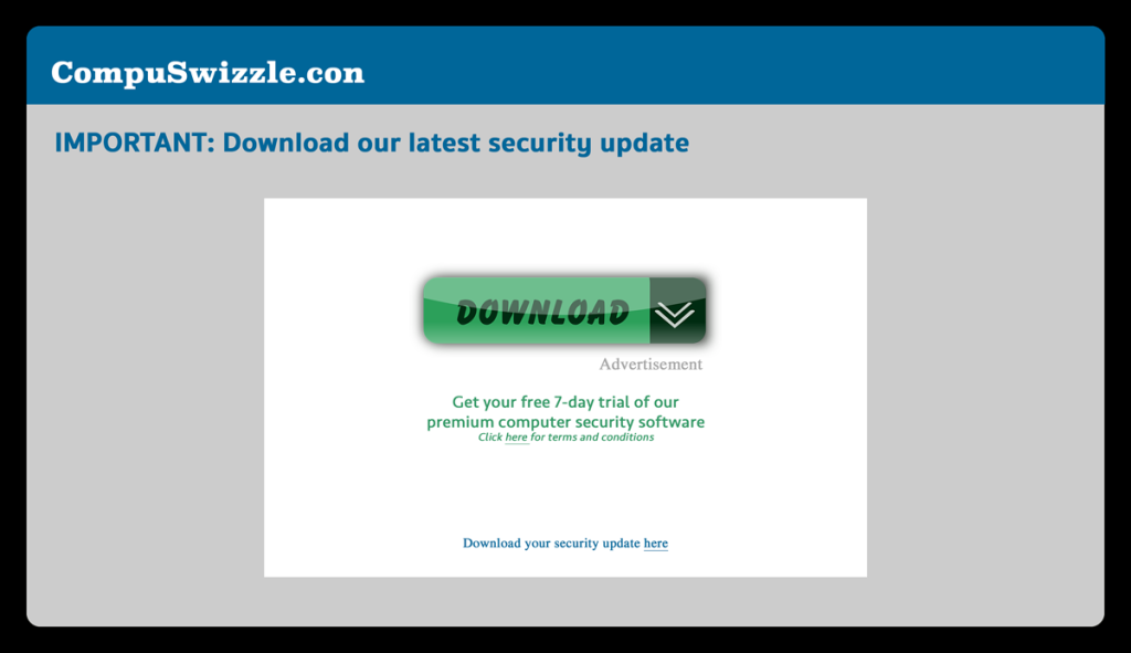
Take this landing page from CompuSwizzle.con. First, you see the headline, then the big green download button.
Then, maybe after you’ve mistakenly clicked that green download button and got the free trial, you might notice the Advertisement sign under the button and the genuine security update link at the bottom of the screen. Doh!
3. Automatic opt-ins
You’re making a purchase, booking or other transaction and when you get to the confirmation screen, you find all the boxes at the bottom have been pre-ticked for you.
Hmmm… helpful — for the company you’re buying from.

I thought automatic opt-ins died a death when the GDPR regulations came in, but I still see them everywhere. And even when I’m careful to opt out of anything I don’t want, I seem to get the marketing emails regardless.
4. Automatic subscriptions
You’re paying a monthly subscription to an online platform, but you haven’t realised that your subscription doesn’t cover a particular feature. One day, you click to allow it and, without any prior warning, you find your subscription has been upgraded to a higher cost plan that does include the feature.
And because this is part of the user agreement, which you didn’t read as carefully as you should, it’s now virtually impossible to cancel it.
5. Bait and switch
In Dark UX terms, a bait-and-switch is a scenario where you’re baited to carry out an action, but that action has unexpected, and often unwanted, consequences.
Like in this example, when Microsoft wanted everyone to upgrade to Windows 10 and hit users with this pop-up box.
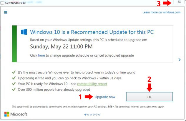
The box tells users that their PC is scheduled to upgrade and gives a date. But what if you don’t want the upgrade?
How should you cancel it and stop it from being automatically downloaded and installed on your computer?
On the screen, the most obvious options available to you are:
- Upgrade now — which you obviously don’t want to do
- OK to accept the scheduled upgrade — which you don’t want either
- X in the top right corner of the box to shut it down.
When users couldn’t see any better options, they chose 3 and clicked the X in the corner to shut down the box.
But that’s not what happened.
If you look at the X in the top right corner of the screen and then look at the the top left corner, you’ll see it says Get Windows 10. So clicking on the X automatically downloaded and installed the update.
What they should actually have done was click the word here underneath the date.
Sneaky indeedy.
6. Confirmshaming
As it sounds, confirmshaming is where a company tries to shame you into doing what they want you to do. It’s most commonly used when you’re being pressured to buy, trying to opt-out or trying cancel a service.
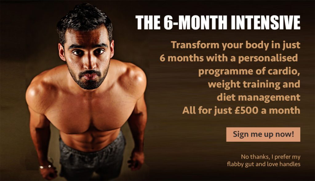
In this example, a pop-up appears on a website advertising a 6-month intensive gym programme.
There could be all kinds of reasons why you might not want to sign up for this. Maybe you have too many other things to deal with. Maybe you can’t commit the time. Maybe you can’t afford £500 a month.
But the opt-out you have to click to close it down is a body-shaming ‘No thanks, I prefer my flabby gut and love handles’, which is designed to shame you and make you feel bad about it.
7. Default options
You go into a screen of a conversion process, only to find the options have been preselected for you.
Some might say that it’s just a case of re-selecting the options you want, but it’s still presumptuous and cheeky.
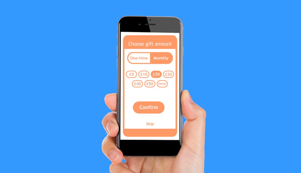
Take the example in the picture. The website clearly wants a monthly donation of £20.
But the user is wondering:
- Is this the expected donation?
- Is the option most people are choosing?
- If I choose a lesser amount, or a one-time option, will I seem mean?
The positioning of the Other button, to the right of the £50 option, subtly implies that other means more then £50.
And the Skip hyperlink is buried at the bottom, where some users will miss it.
8. Easy to sign up — hard to cancel
You’ll find companies falling over themselves to sign you up to things. And they’ll make the sign-up process really easy. A few taps on the keyboard, your credit card information and you’ll be good to go.
But when you want to cancel, it’s a different story. You might find the cancellation terms were hidden or buried in the small print when you signed up.
And now you find the company is insisting on things like:
- A lengthy cancellation period
- Cancellation in writing/by post
- Fees for cancelling early.
Free trials
If you’re signing up for a free trial with your credit card information it’s especially important that you find those terms and read them before you commit. Companies rely on people forgetting to cancel the trial — and it’s then those people find themselves tied into a contract that’s really difficult to get out of.
Cancellation statistics
Dark UX is rife in online cancellation processes, as emailtooltester found when they looked at dark patterns in subscription services.
They found it takes an average of 7 steps for users to go from the homepage to successfully cancelling their subscription.
Of the big brands they researched:
- 87.5% used guilt copy to guilt their customers into staying
- 55.0% used copy designed to shame them into staying
- 52.5% used design barriers to make cancelling harder
- 45.0% demanded a reason for cancelling.
9. Fake scarcity
Fake scarcity cons you into thinking there is limited availability. It capitalises on your fear of missing out, so you feel pressured into taking an action straight away.
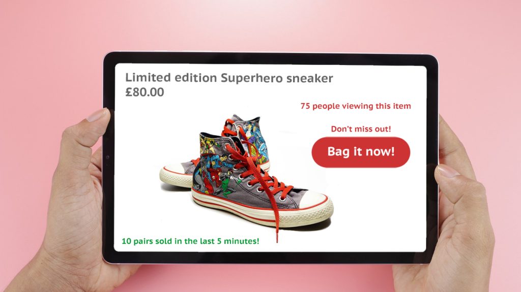
In this example, there are several indicators of scarcity at play:
- The limited edition product
- The number of people viewing the product
- The number of pairs sold in a short time
- The don’t miss out call to action.
And these all work together to pressurise you into buying quickly.
So when is it fake?
Some websites use e-commerce plugins designed to indicate scarcity where there is none. For example, by auto-generating false viewer numbers and fake purchases in real-time and displaying them on the screen. This fools users into thinking an item is popular and selling fast.
10. Fake urgency
Fake urgency also capitalises on your fear of missing out. This time by adding a time pressure to your purchase.
The website creates a sense of urgency using a countdown clock, which is counting down the time until the end of a sale or discount period. In the case of fake urgency, the countdown clock is fake and will often reset itself when the timer runs out.

In this example, the website is giving you a 25% discount until the clock counts down to zero. But if you don’t want to succumb to the time pressure, you can restart the clock by revisiting the site in Private mode.
11. Forcing users to complete an action
You want to take an action, but to complete that action, you feel like the website is forcing you to do something you don’t want to.
For example, you could feel forced to:
- Take a free trial you don’t want
- Create an account to make a one-off purchase
- Provide access to your emails to import your contacts
- Give away more private information than you wanted to.
In most cases, there will be an option on the screen that allows you to skip or decline this part of the process. But that option is often hidden and difficult to find. And even if you do find it, the website may try to shame you into taking the option it wants you to.
12. Guilt-tripping
This technique is commonly used when you’re trying to cancel something or downgrade your subscription. And it uses manipulative language to make you feel guilty about your decision.
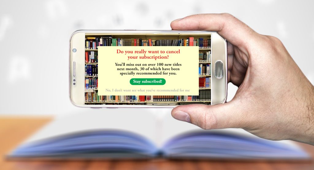
In this example, an online book club tries to guilt-trip you into staying subscribed. It tells you what you’ll be missing out on and that they’ve taken the time to specially recommend new titles for you.
Scratch that. Their algorithm has found some new titles you might like, based on your previous choices.
I mean, how could you possibly still want to unsubscribe now?
13. Hidden information/options
Companies are obliged to give you certain information and options, but they don’t always want to. So they’ll find ways to hide or obscure them and make them difficult to see.
For example:
- Hiding alternative options as hyperlinks in the small print
- Hiding important terms using colours with poor contrast.
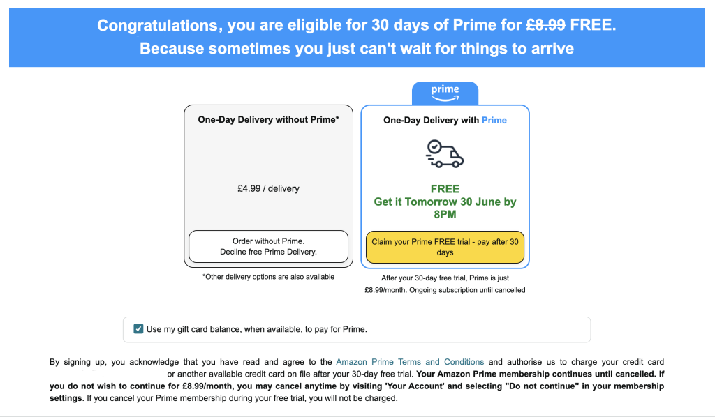
When I was first confronted with this screen, it took me longer than it should have to realise I didn’t have to sign up for the free trial of Prime. Looking at it now, I can see why. The yellow button on white looks like a button, but the white button on white doesn’t.
There are other issues, too, like:
- Presuming I’ll want one-day delivery
- The slash in £4.99 / delivery — what does that mean?
- The miniscule Other delivery options text that’s easy to miss.
When I declined the Prime Delivery and trial and went to the checkout, there was an option to get free delivery a couple of days later.
14. Incomplete products
“Would you like a plug with that?”
Yes, that’s right. The plug for the electrical appliance I was about to buy was sold separately, for an additional price. So when I thought I was getting a bargain, it was because the plug that powered the product wasn’t included. Brilliant.
Selling incomplete products, that won’t work without sold-separately appendages, is another form of Dark UX.
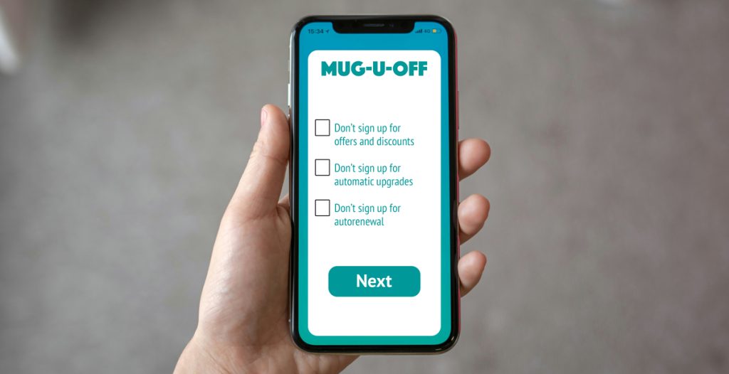
15. Misleading language
Misleading language is designed to confuse you, so you don’t know which option to choose.
The example below is confusing because we can’t be sure which button will cancel the order.
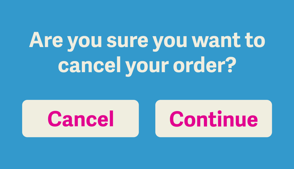
In the example below, the boxes aren’t pre-ticked. Ticking the boxes is usually a positive acceptance, but the language in the case is negative. So it’s not immediately clear whether ticking the boxes will sign you up or not.
16. Obstructive processes
The company wants you to take a specific course of action, but they have to offer you an alternative. So they make it easy to accept their desired action, but choosing the alternative as difficult and convoluted as possible.
In 2019, my partner and I had booked a holiday to the Greek island of Zante. We’d researched it carefully and had found a perfect hotel in its capital, Zakynthos, right on the harbour.

A few weeks before the holiday, I had an email from our travel operator. It said our hotel was no longer available and they were moving us to another hotel — in a different resort on the other side of the island.
They seemed pretty confident we’d be okay with that, because there seemed to be no alternative. But, in reality, the change of resort would have made it a very different holiday to the one we had planned — and we weren’t happy to accept that.
I had to read the email three times before I finally found the option to cancel: a phone number, buried in the small print. When I called the number, it was a random department that had nothing to do with cancellations and they seemed surprised to get a call from outside the office.
I was passed from pillar to post for 30 minutes before they finally directed me to someone who could help. And although I eventually managed to get a full refund, they deliberately made it difficult.
A less relentless person might have given up, which I think is what they hoped would happen.
17. Persistent pestering
Devices and online platforms keep badgering you to take an action even after you’ve declined.
For example, that might be repeatedly needling you to:
- Sync your services
- Turn on push notifications
- Upgrade your subscription/package
- Downgrade your service rather than cancel.
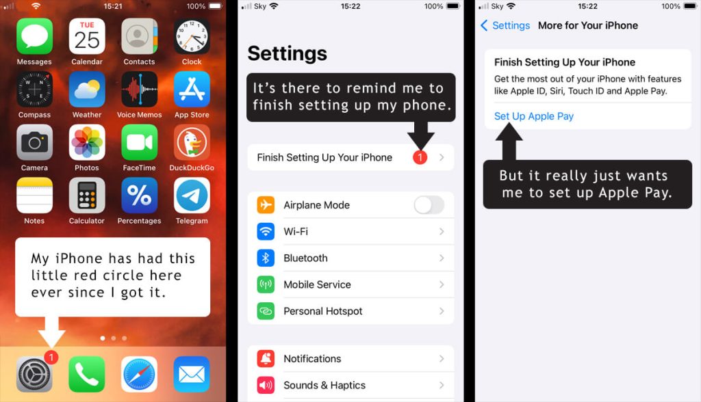
This little red circle notification has been on my iPhone home screen ever since I got it.
It’s there to remind me that I haven’t finished setting up my iPhone. But what it really means is that I still haven’t set up Apple Pay. And I probably never will, because I’m stubborn like that!
This isn’t as in-your-face as some persistent pestering I’ve seen, but some people would be hella annoyed by having a permanent notification on their phone screen. And Apple knows these people will do what they want and set up Apple Pay just to get rid of it.
18. Privacy Zuckering
Privacy Zuckering involves deliberately obscuring or delaying the option for users to opt out of sharing their information, so they think they don’t have a choice in the matter.
As you might have guessed, this particular kind of Dark UX is named after Facebook co-founder and Meta CEO, Mark Zuckerberg. His platforms have used these methods to trick their users into sharing more private information than they really wanted to.
19. Sneaking through amendments
You’re just enjoying your social media feed or working on your online platform, when you’re suddenly interrupted by a pop-up. The pop-up is asking you to accept amendments to the terms of use or privacy policy. And they want you to accept those changes on the spot.
The pop-up has interrupted your user experience and is asking you to review what is probably a lengthy document with the amendments buried in it somewhere.
So what do you do?
Do you read the terms/policy that you’ll probably have to accept to keep using the platform anyway? Or do you just press the Accept and close button, which is quickest and easiest, and will allow you to carry on with what you were doing before they interrupted you?
This is how they sneak through amendments they know you would never agree to.
20. Tiny or hard-to-find ‘X’ buttons
You often see these on websites with third party advertising. An ad will appear somewhere on the screen — usually in a place that’s inconvenient and spoils your experience.
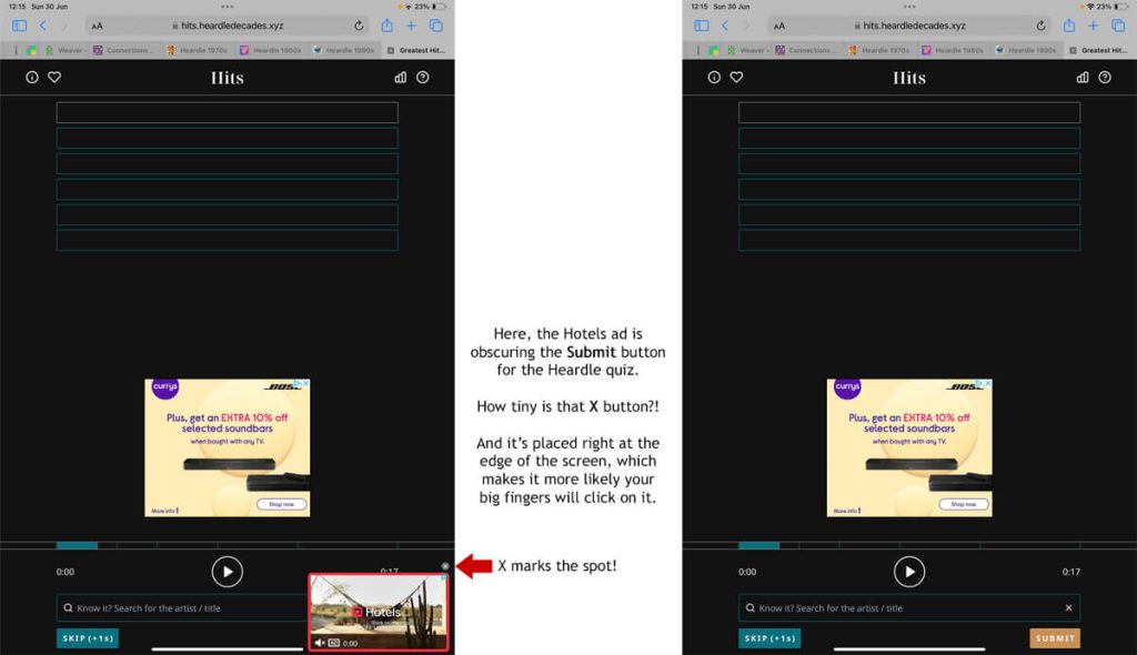
In this example, the Hotels ad is obscuring the Submit button for the Heardle quiz. There is a delay in the X button appearing and when it does it’s tiny and right at the edge of the screen where it’s difficult to press it. This means there’s a good chance you’ll click on the ad itself and be taken to the third party website.
A pain for you — a payment for the referring website.
Moolah-ha-ha!
21. Uncomparable comparison tables
A Dark UX comparison table is deliberately vague or doesn’t follow a consistent pattern. This makes it difficult for users to compare the offers presented.
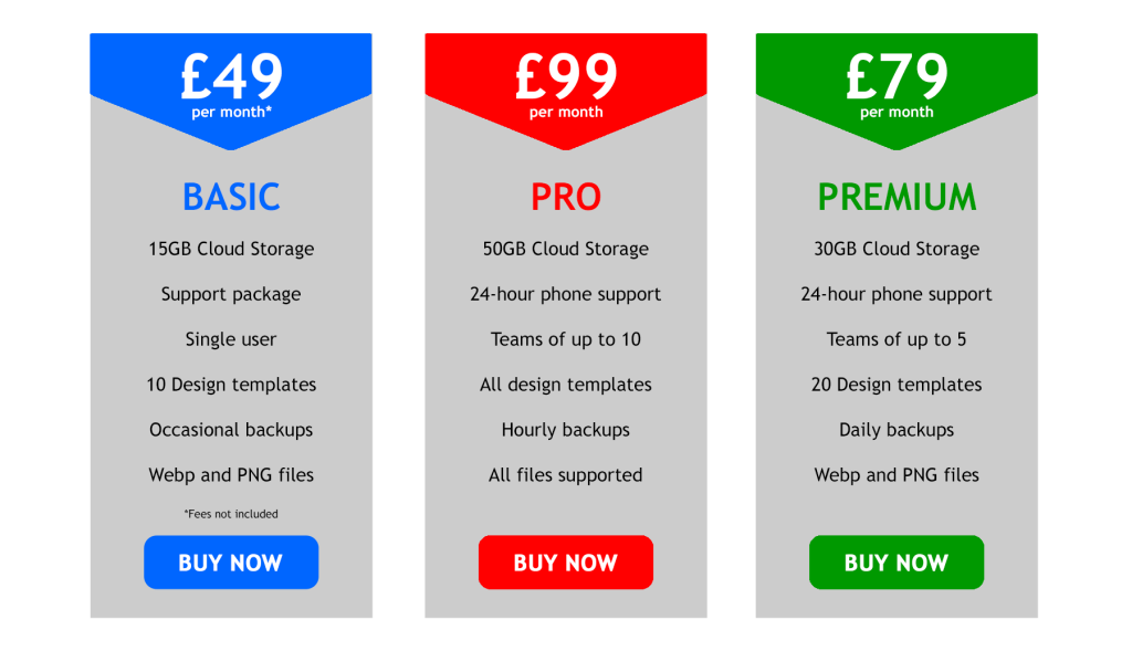
For example, this comparison table has several issues.
The Basic package has an unspecified support package and only occasional backups, which makes it difficult to see what you’re getting. And that £49 per month doesn’t include fees, so how much are they?
The Pro package is equally vague. It says you get all the design templates, but it doesn’t specify how many there are in total. And it says all files are supported, but that’s still too vague.
22. Unexpected charges
You’re going through the process of making a purchase when you’re suddenly hit with a raft of unexpected charges.
For example, you’re ordering something, but when you get to the checkout you find the astronomical delivery charge is almost as much as the product you’re buying. Or the package you’re buying has unexpected fees attached.
Budget airlines were one of the worst for this, advertising really low fares that only applied if you:
- Were only going one way
- Had no baggage to take on board
- Didn’t need a seat on the plane!
Final thoughts
As a digital copywriter and website expert, who spends most of my working life online, I’ve seen all of these dark patterns on my travels. And even though some of these examples are perfectly legitimate and above board, they still have a manipulative undertone.
As a regular internet user, I’m always vigilant for these tricks and techniques. And I’m careful not to take actions that will compromise my privacy or sign me up for things I don’t want. But many internet users are less savvy and more easily coerced, which is why Dark UX feels so wrong and predatory.

Looking for an ethical copywriter?
I’m Jenny Lucas, a freelance copywriter and content writer based in Leicester, UK.
One of my key values as a copywriter is taking an ethical approach and treating others as they would wish to be treated if they had the choice. So when I’m working on web copy, I will always advise against anything that resembles Dark UX.
If you want to work with an ethical copywriter who will respect your audience, maybe I can help.
You can find out more about me:
You might also like…