UPDATED APRIL 30, 2024
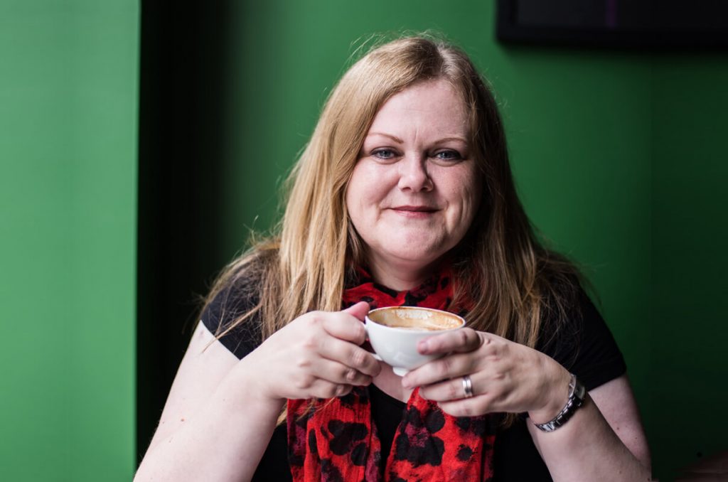
This is where I live and work
My partner is a farmer and comes from a family of farmers.
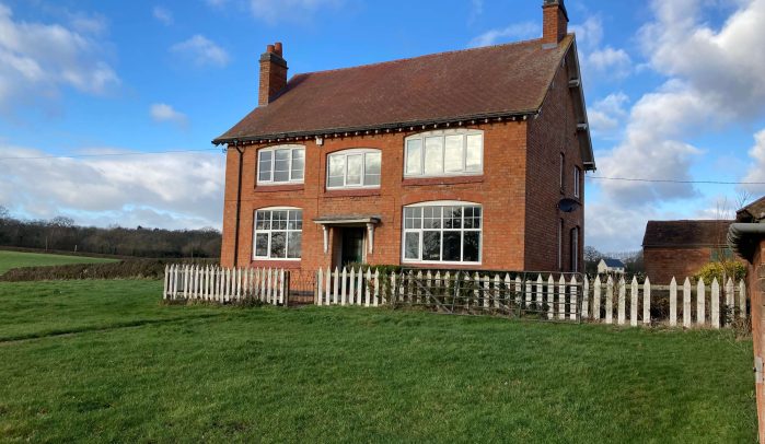
This is the farmhouse he grew up in, with his parents and two half-brothers. And now, following more than two years of renovations, it’s become our home.
John works outside on the farm and I work inside as a freelance copywriter.
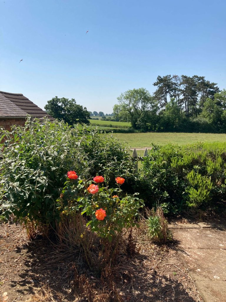
It’s a beautiful setting and we consider ourselves very lucky to be here. Just look at these views!
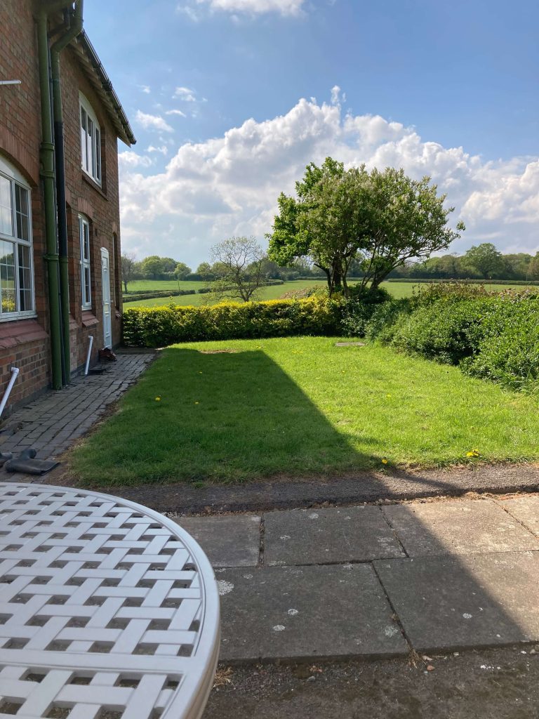
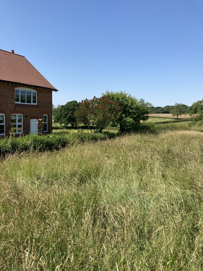
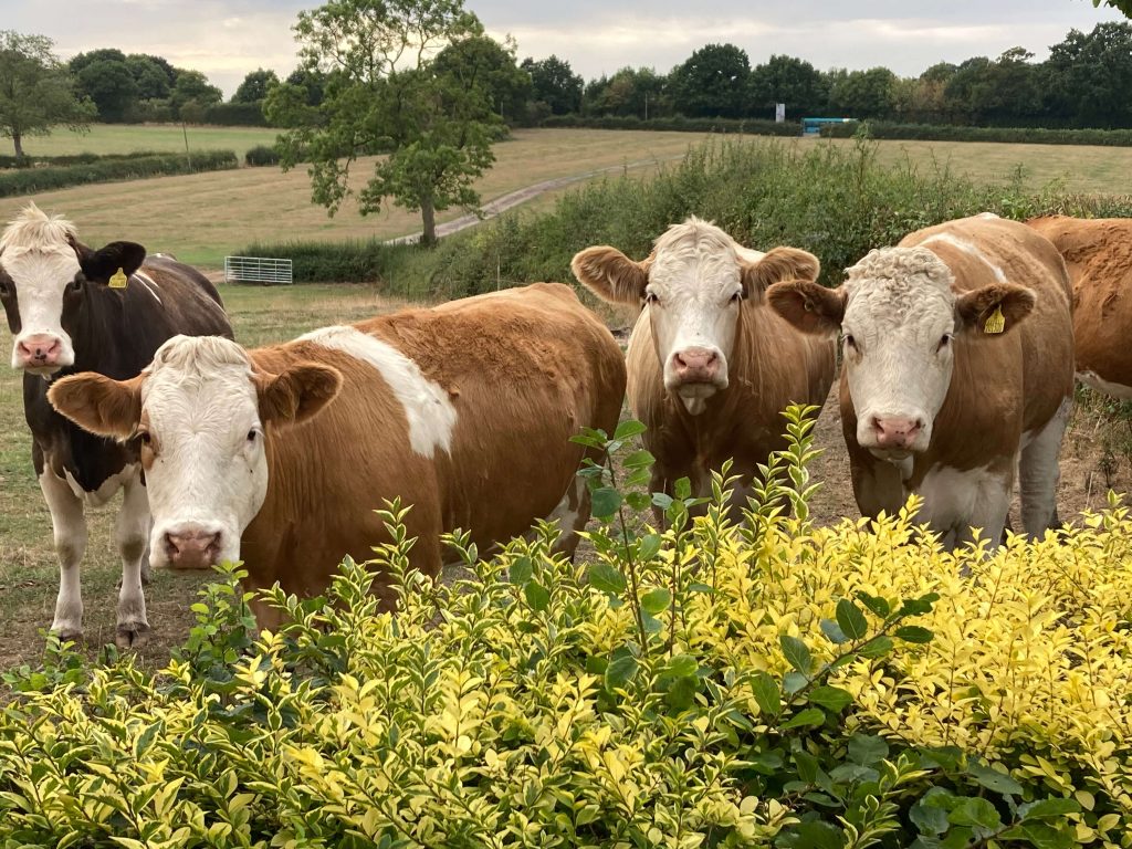
The neighbours are a tad nosy, though!
The renovation
Two years ago, the house was a mess. Many of the rooms hadn’t been used for over a decade and the amount of work that needed to be done was overwhelming. With both of us working full time, I couldn’t see how we’d ever get it all done.
But, somehow, we did.
So, without further ado, let’s go inside and take a look around.
The back entrance
The main entrance is the back entrance, which used to look like this.
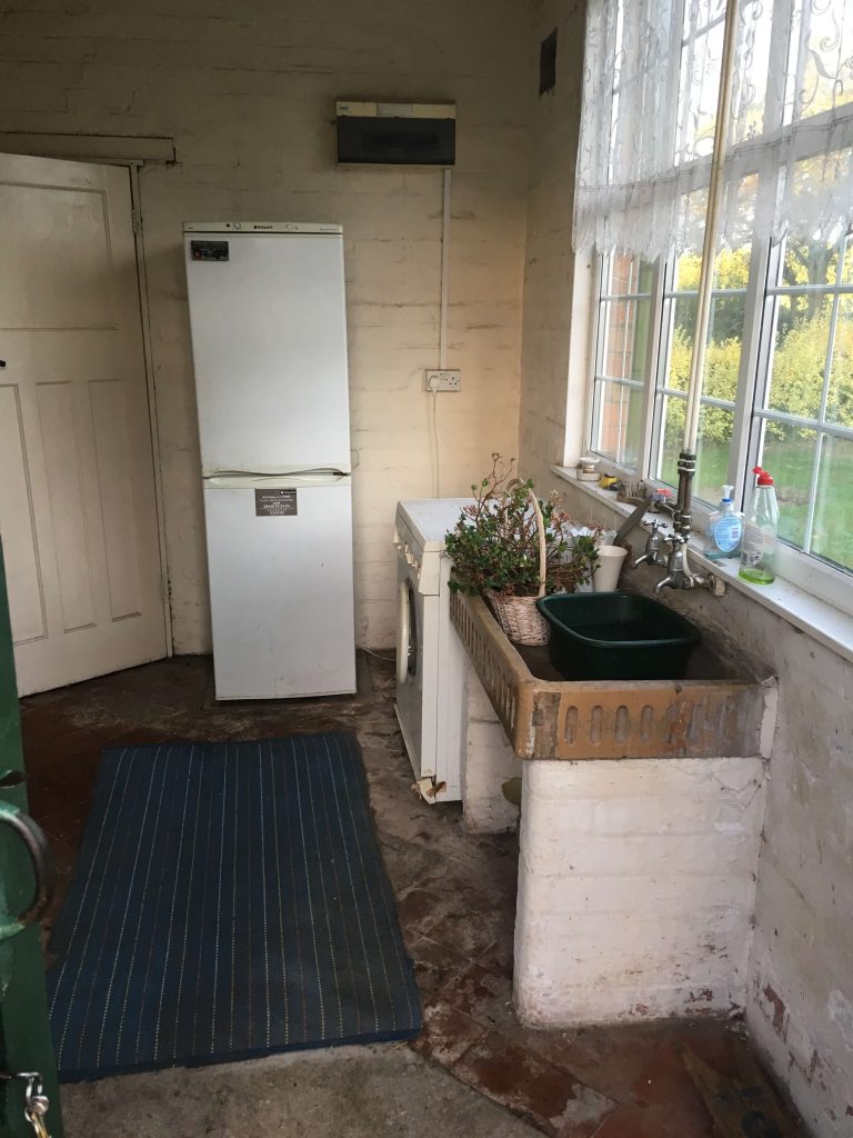
It still had the original flagstone floor and a pedestal sink against the wall. To the left, behind the door, was a large freestanding cupboard filled with farm paraphernalia.
It was a functional room. A place for taking off dirty boots, hanging up coats, and washing up after working outside.
And it needed to stay that way.
The room is now our utility room. It’s still the place for taking off muddy boots and coats. But it’s also a hub for our new heating system, a place to wash and dry laundry and a home for our fridge freezer.
It now looks like this.
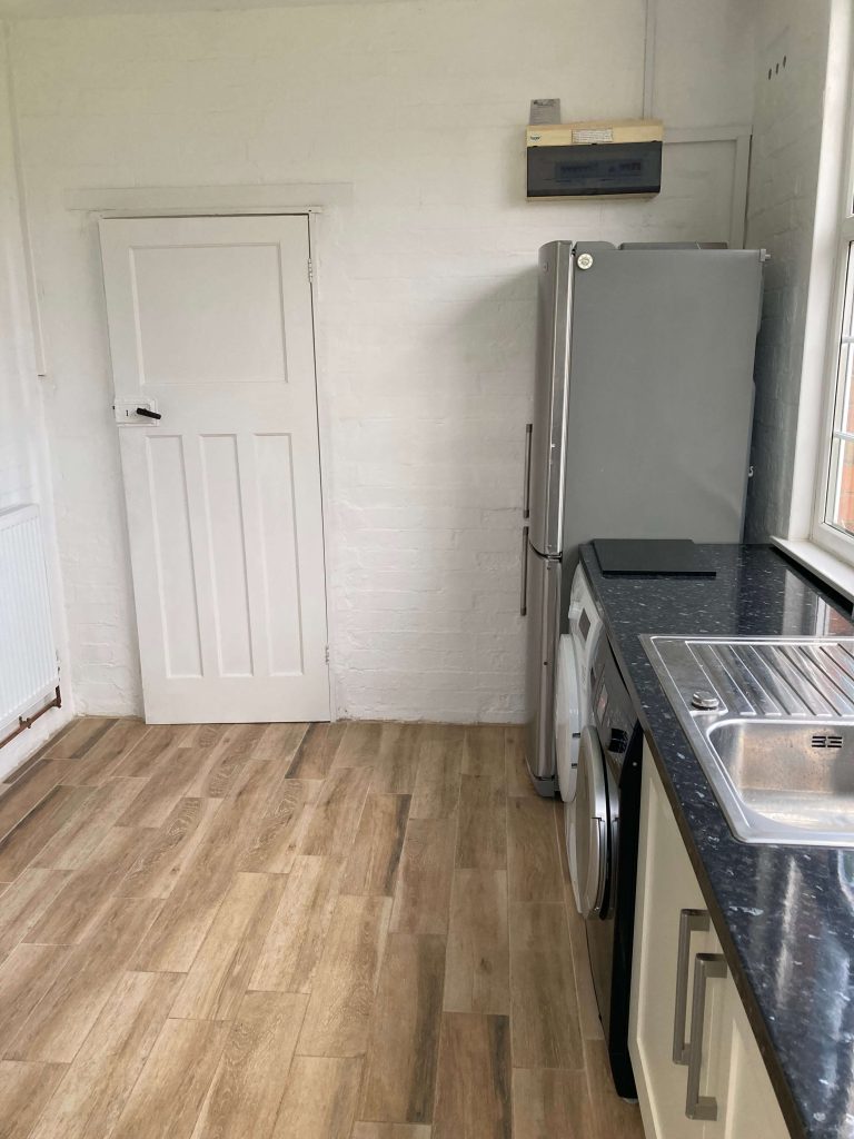
The old flagstones have been topped with screed and finished with wood-effect ceramic tiles.
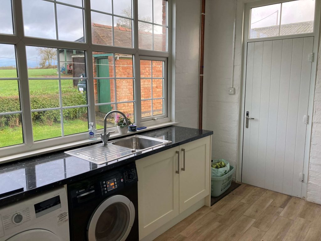
We’ve installed a full worktop with a new sink and cupboard.
And the freestanding cupboard, which was falling to pieces, has been removed to make way for a new boiler and heating system.
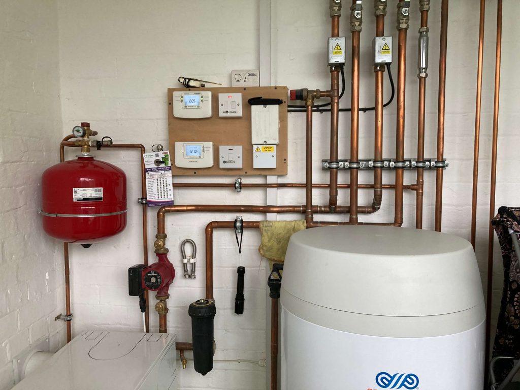
The pipework is a real work of art! And the tanks warm the room, so it’s a great place for drying wet coats and washing.
The kitchen
The inner door of the utility leads into the kitchen, which used to look like this.
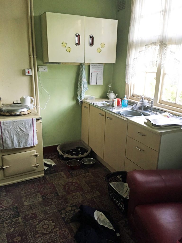
Before we moved in, the farmhouse had no central heating. There was just the old Aga in the kitchen and an open fire in the lounge.
The kitchen is on the back of the house, which doesn’t get much sun. It only had one window and often felt quite dark. Behind the red chair in the corner was a solid PVC door.
And, yes, it had a carpet!
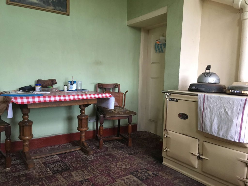
Against the other wall was a large table with two dining chairs. As there wasn’t much worktop, the table was a useful place to put things down.
The door leads into a sizeable pantry. And, apparently, pantries are making a comeback! It’s such a useful room to have and, because it’s cold, it’s ideal for storing food and wine.
The kitchen now looks like this.
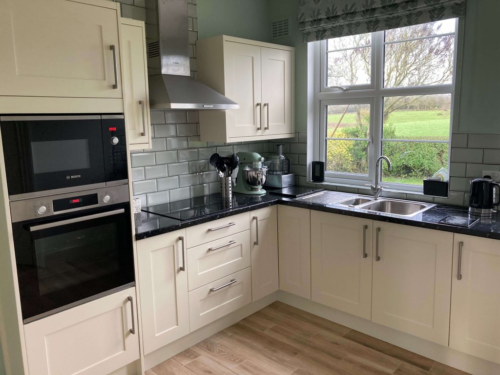
We took out the old Aga, which should have been condemned, and replaced it with a microwave, electric oven and hob. And we replaced the old kitchen units with some matching modern ones in a paler colour that would reflect the light better.
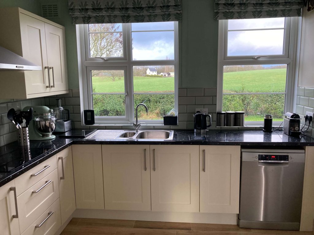
Removing the redundant PVC door allowed us to put in a second window, which has really brightened up the room. It also meant we could extend the worktop and install a dishwasher underneath.
We never had a dishwasher before and I’m wondering how we ever managed without one!
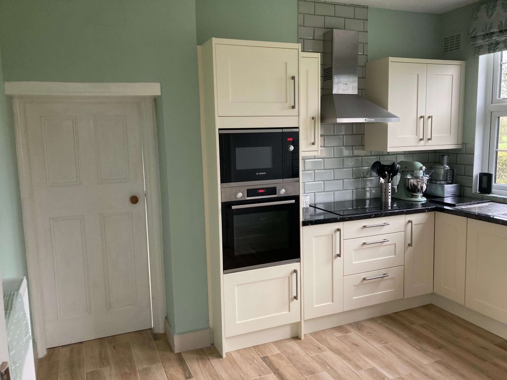
We kept the pantry and had a radiator installed where the table used to be, which makes the room much more spacious.
And we kept the walls green, but chose a different shade. The label on the can said it was Sage, but looks more like mint to me!
From the kitchen we go into the lounge.
The lounge
The lounge is on the front of the house, which means it gets the morning-to-early-afternoon sun.
It used to look like this.
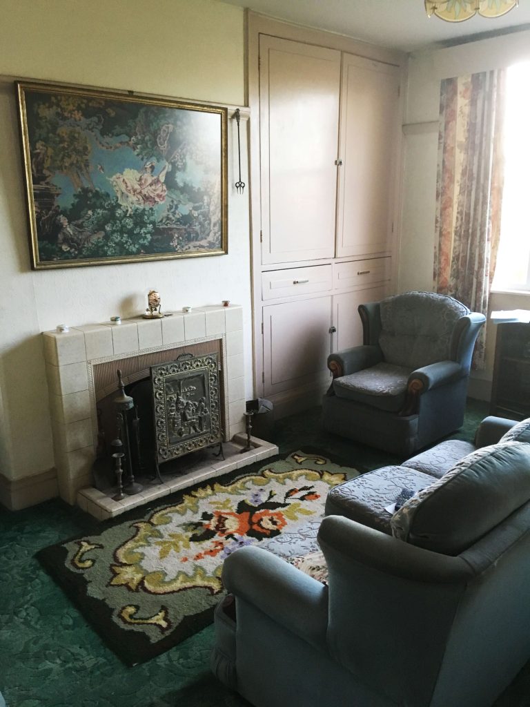
Before we moved in, it had a three-seater sofa and two chairs. Under the window was a small, and very full, glass-fronted bookcase. And behind the sofa was a large display cabinet filled with ornaments.
It’s a large room, but all the furniture made it feel much smaller.
The artwork above the fireplace was hand-embroidered by my partner’s mum.
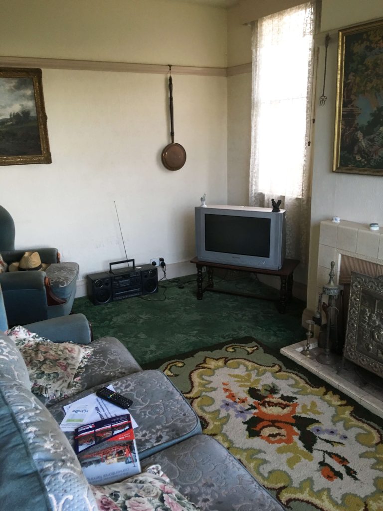
When we stripped the old wallpaper, the plaster came off with it. And we found the windows had been packed in with balls of screwed up paper. They must have been some cowboy window fitters. No wonder the wind was blowing through and moving the curtains inside!
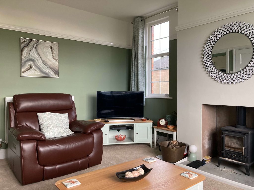
The lounge now looks like this.
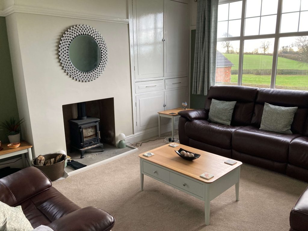
We replaced the old three-piece suite with a new leather sofa and chair. And we removed the old fireplace and fire to make way for a wood burner, which we can use as a backup if the power ever goes down.
The rest of the house hadn’t been lived in for more than a decade. The second lounge was used to store furniture. And my partner’s dad felt too unsteady on the stairs.
My partner’s parents were collectors and the other rooms were filled with furniture and other items they’d collected over the years, so the before pictures are a bit more limited from here.
The hall
The hall and stairs used to look like this.
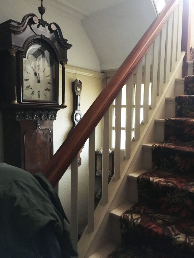
The hall was taken over with this enormous grandfather clock, which blocked a lot of the light coming in through the door. And the stair carpet had been in place for more than 50 years.
The hall now looks like this.
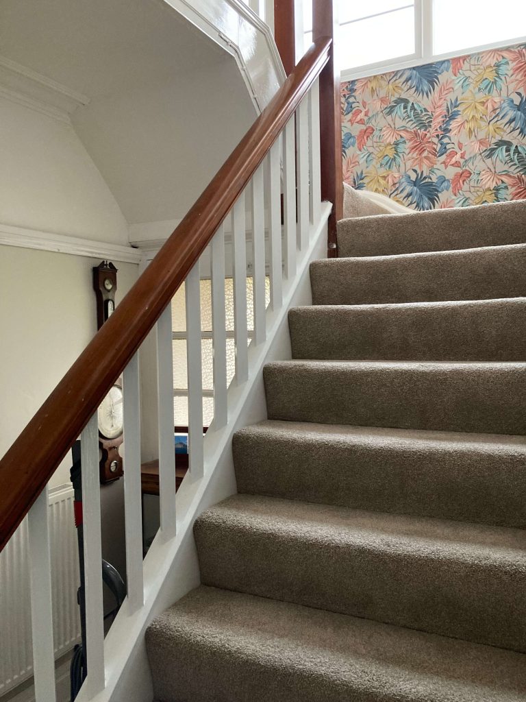
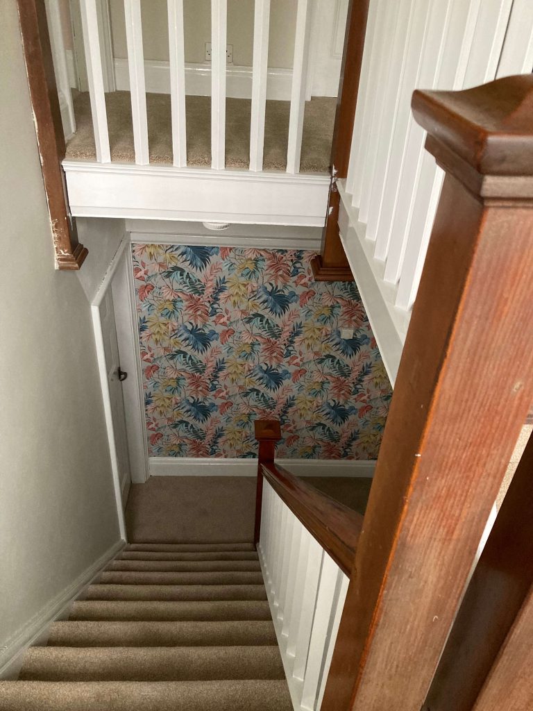
We’ve removed the grandfather clock and replaced old the stair carpet. And we’ve added some wallpaper at the top and bottom of the stairs to add a burst of colour.
Oops, just noticed we need to clean some paint off the wood there — but you get the idea!
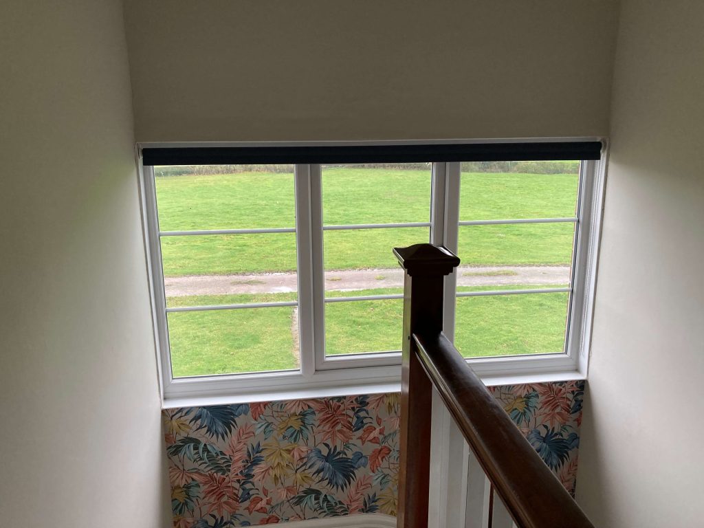
At the top of the stairs, we removed the curtains and pelmet and installed a roller blind instead. This means we get the most light possible from the window during the day.
The dining room
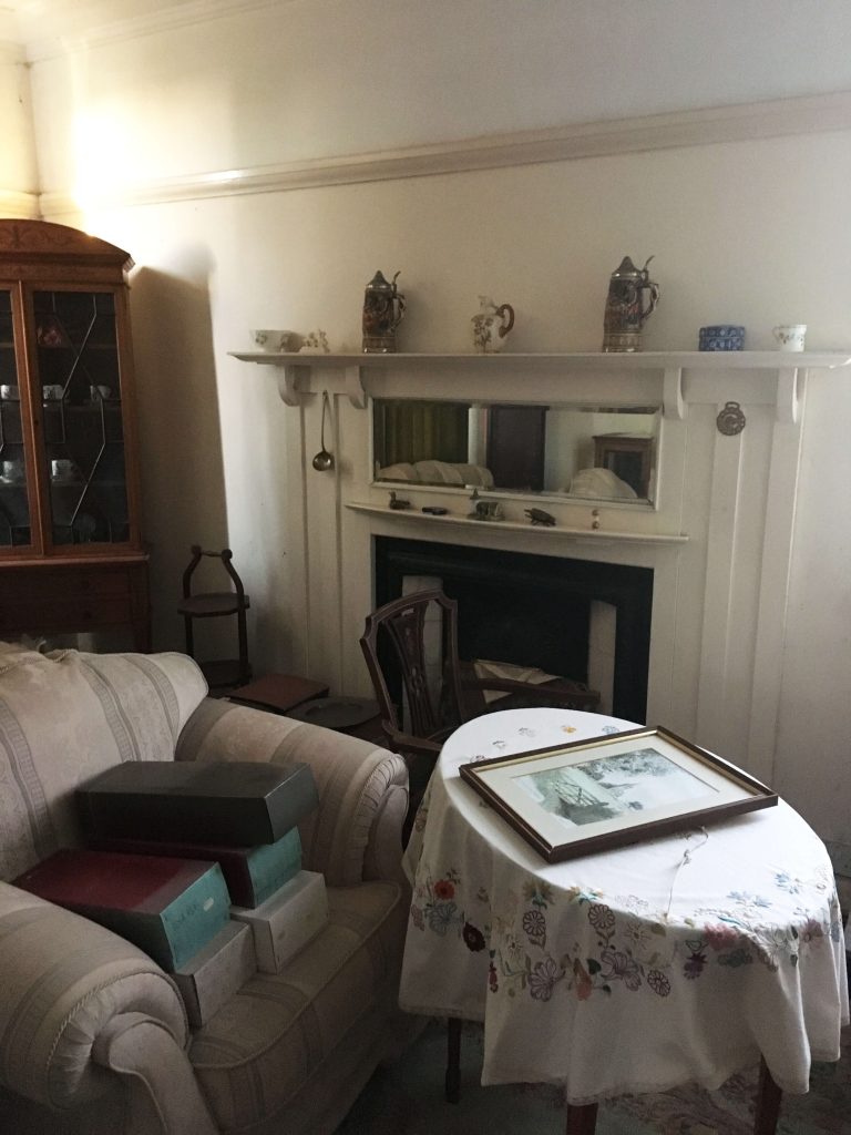
The dining room used to be a second lounge, but became a store room for unused furniture and other items.
Now it looks like this.
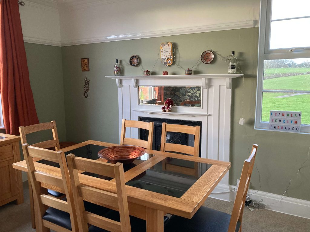
We restored the old fireplace, painted the walls and created a feature wall.
The room is surprisingly spacious and accommodated our dining table with ease.
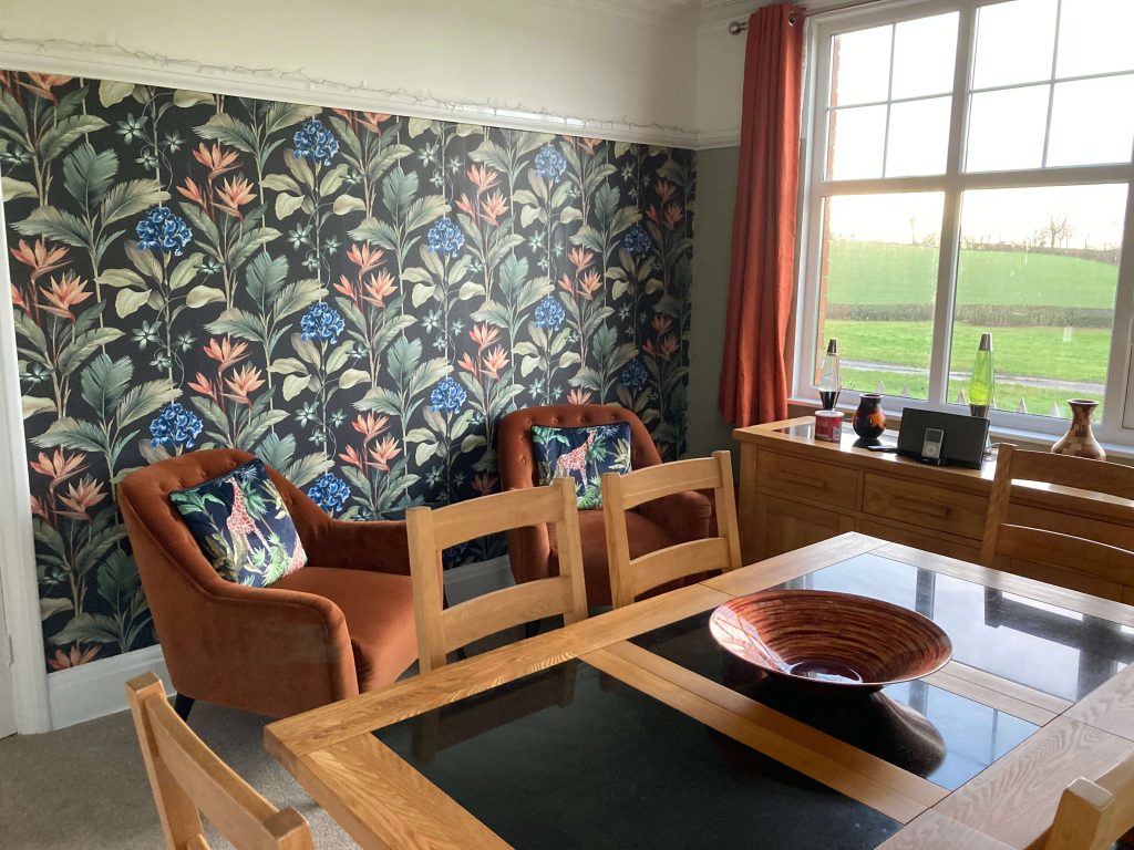
We even had enough room to create a cocktail area along the other wall!
Gotta love those giraffes!
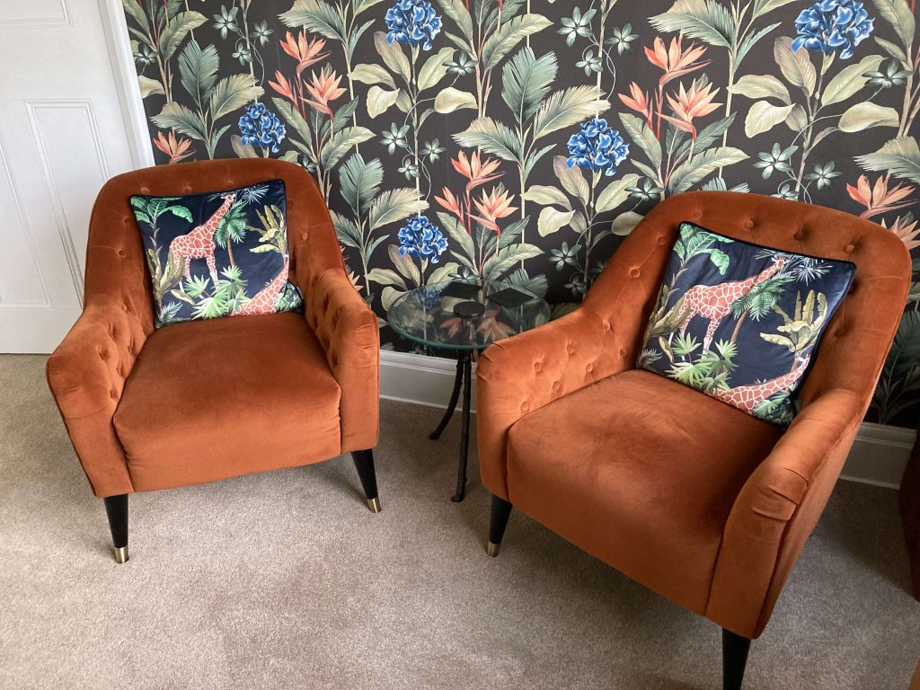
Spiced orange is one of my favourite colours.
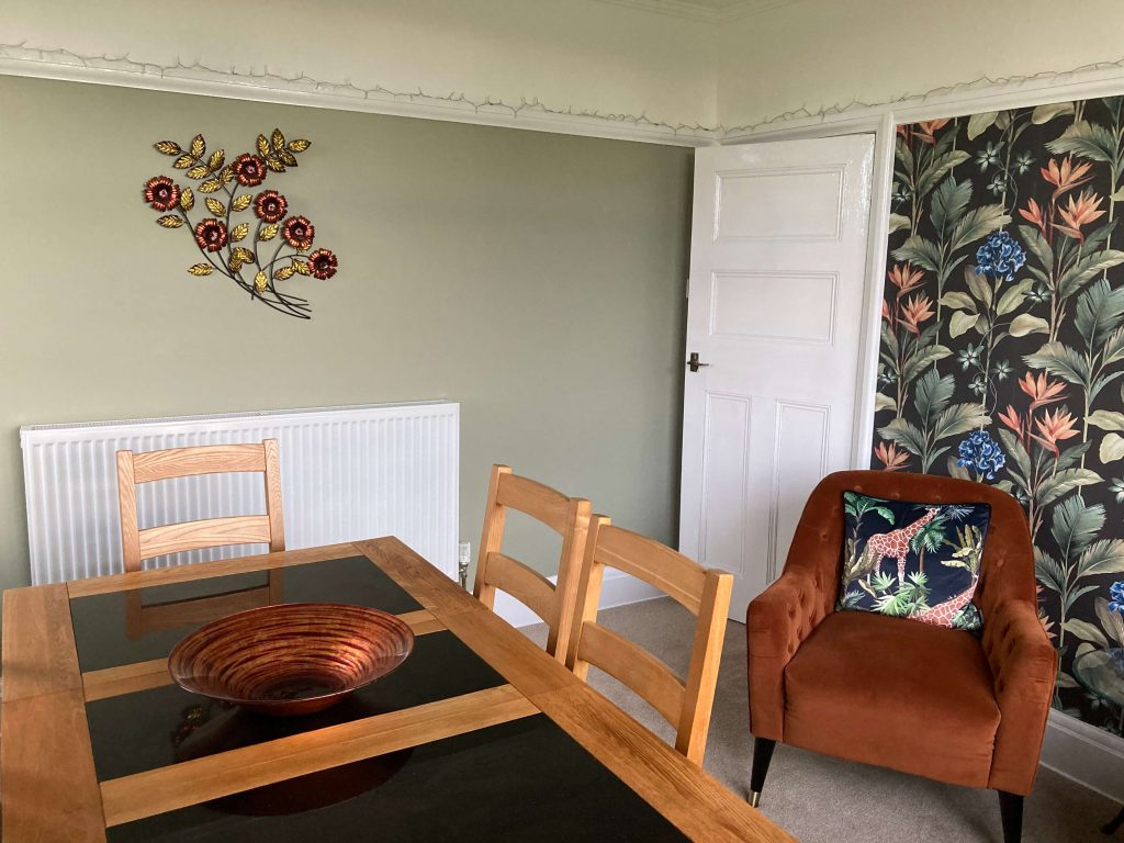
And the metal wall art above the radiator pretty much inspired the whole room.
Now let’s go upstairs…
The main bedroom
The house has three good-sized bedrooms, but we chose this one, because it had the wall space for a big wardrobe.
The original wardrobe was huge and made of dark wood, so it dominated, and darkened, the whole room. When we came to remove it, we had to hack it to pieces with tools just to get it out of the door!
The rest of the room was filled with a collection of antique prams and pushchairs. I don’t know why, exactly, but they gave me the creeps!
This is how it looks now.
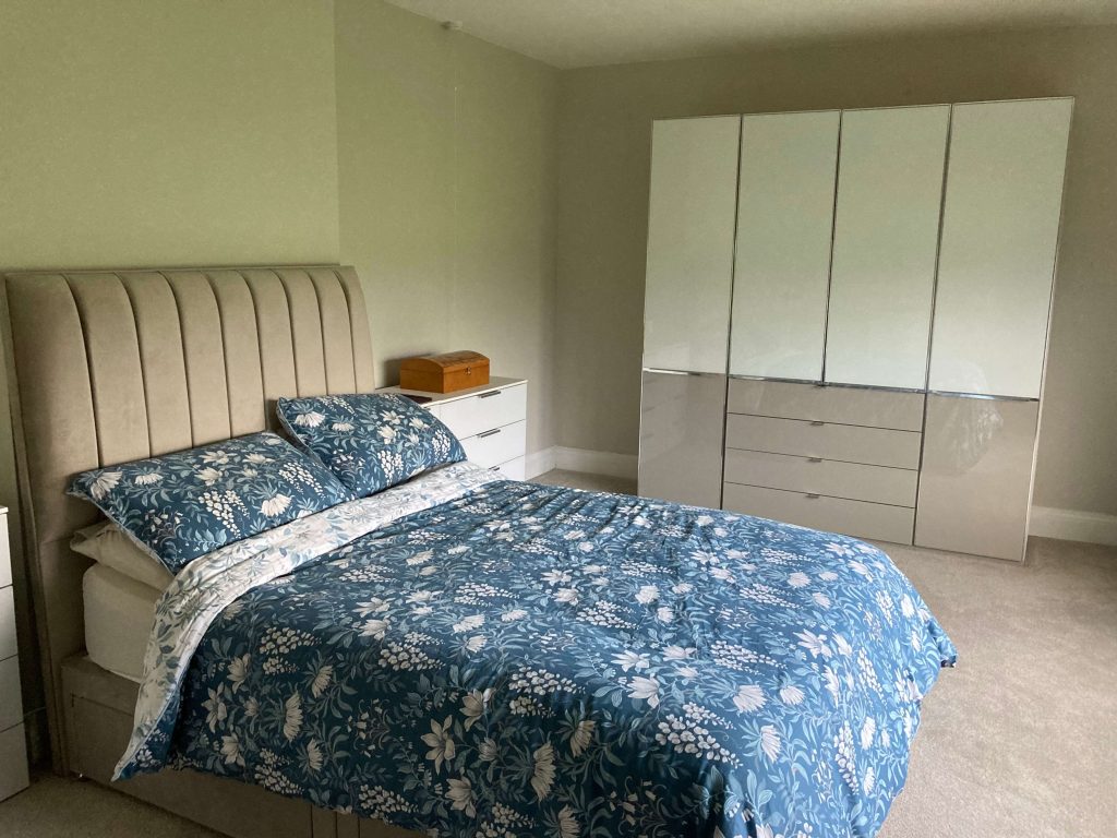
We kept the colour scheme light and neutral with white and beige furniture and Egyptian Cotton walls. The glass-fronted furniture is reflective, which helps to bounce light around the room.
The neutral colour scheme was all so we could go big on the bedding!
In our last home, we painted our bedroom walls terracotta, then could never find bedding that would match it. But in this room, anything goes!
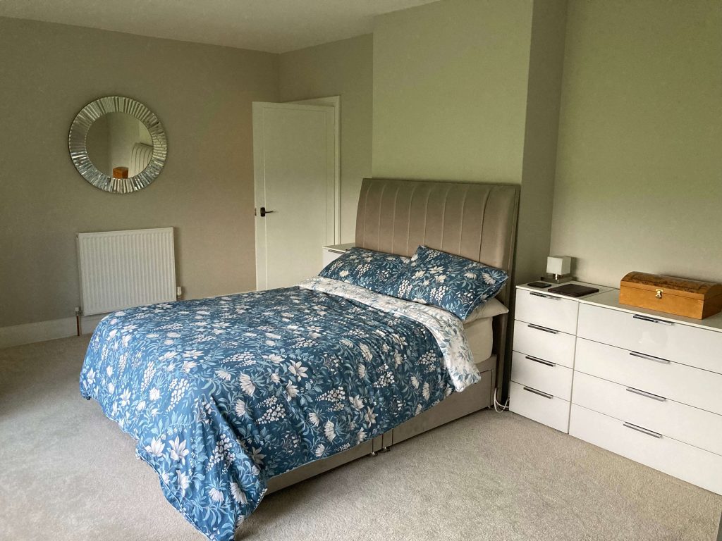
The mirror was a freebie. It should have been £300, but was slightly damaged and destined for the skip. We rescued it gladly.
The bathroom
The bathroom is huge, but it was a complete mess.
The carpet was faded and the wallpaper bubbling and hanging off the walls.
The toilet hadn’t been used in so long, it wouldn’t even flush!
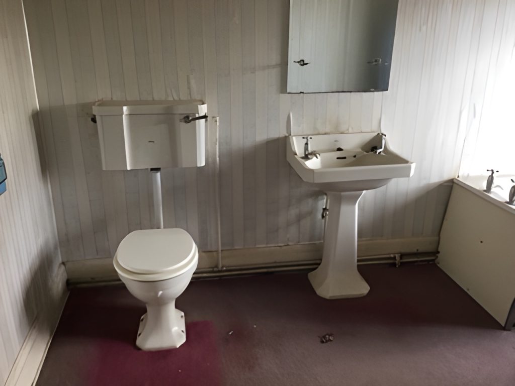
The bath was full of rubble and there was no shower.
The thing you can see on the right-hand side is a fabric screen to undress behind because the window isn’t frosted and there was no blind.
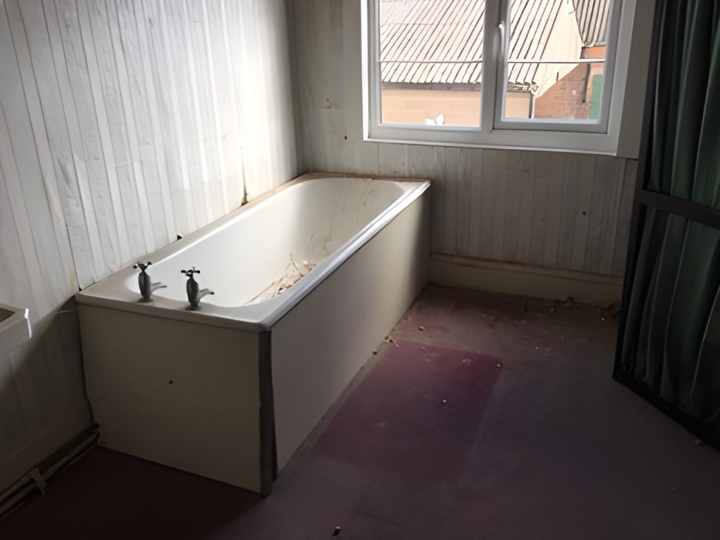
This room needed a big change.
Thankfully, the wallpaper didn’t need much steaming. At least, the top layer didn’t. Under that we found some pink wallpaper with a fish pattern — and that was stuck like it had been super-glued. When we removed the section above the window, chunks of plaster came off with it, revealing huge holes and hollows that needed to be filled.
The new bathroom — or, should I say, shower room? — was professionally fitted.
It now looks like this.
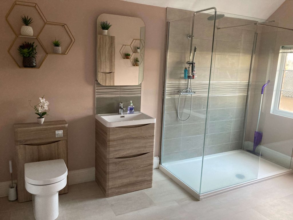
We’re not “bath people”. In fact, I can’t even remember the last time I had a bath. We just don’t have the time.
But the shower at our last place was paltry. A tiny shower head over the bath with no water pressure.
When we moved, we wanted something better — and this is definitely better!
The spare bedroom
I don’t have before pictures of this room, so I’ll have to describe it to you.
The room had a single bed, but was, essentially, a storage area for a collection of antique furniture.
This is how it looks now.
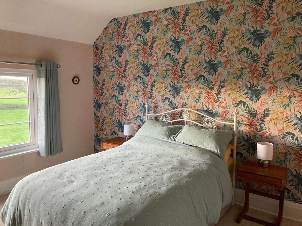
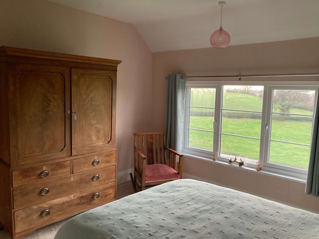
The cabinet you can see below was part of the antique furniture collection and couldn’t be sold, so we kept it and built the room around it.
We also kept the rocking chair next to it. And bought the matching bedside tables from TK Maxx.
The office
We decided to create an office in the third bedroom.
This is probably the nicest of the bedrooms, but it didn’t work as a bedroom with the furniture we had.
As an office, it’s perfect.
I used to run my business from the dining room table, which was never ideal. Having a dedicated office means I can shut the door on it at the end of the day and get some proper separation.
This is our new office, where I spend my working days.
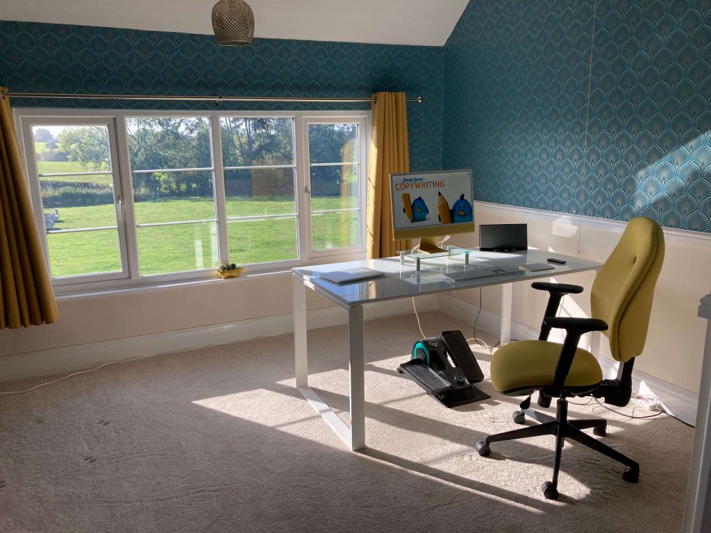
My new desk is a white, glass-topped thing of beauty that’s the size of a dining table. I’ve since learned, a big desk like this is called a ‘power desk’ — and I’m totally okay with that!
I have a proper ergonomically designed chair that supports my back and gives me the best desk posture for working. Bye-bye back ache! And a set of pedals, because I get the fidgets if I’m sitting down for too long.
The art-deco-style wallpaper is teal, light blue and gold. I found it online and instantly fell in love with it.
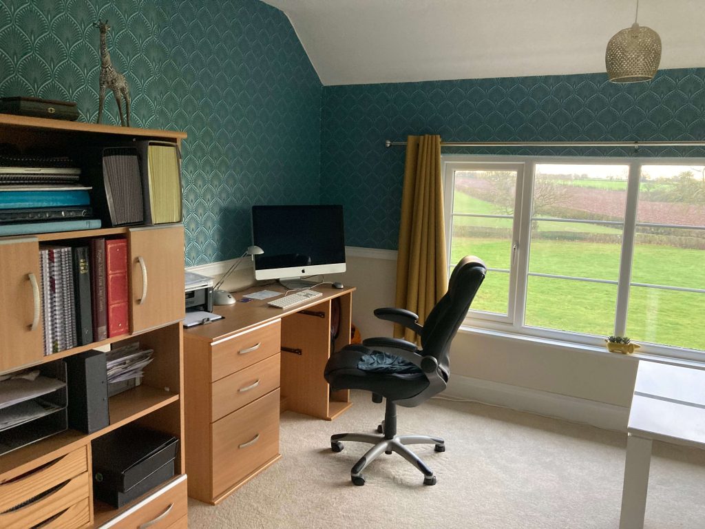
This is my partner’s side of the office.
He’s inherited the furniture and computer we had in our last home office, which was a box room looking out onto a brick wall.
About the author
I’m Jenny Lucas, a freelance copywriter and content writer, based on a working farm in Leicester, UK.
Originally employed as a conceptual copywriter, working on creative campaigns, I now specialise in SEO website copywriting, content strategy and writing blog articles.
To find out more about me and the services I offer, you can visit my main website.
You might also like…

